KakaoBank 3D
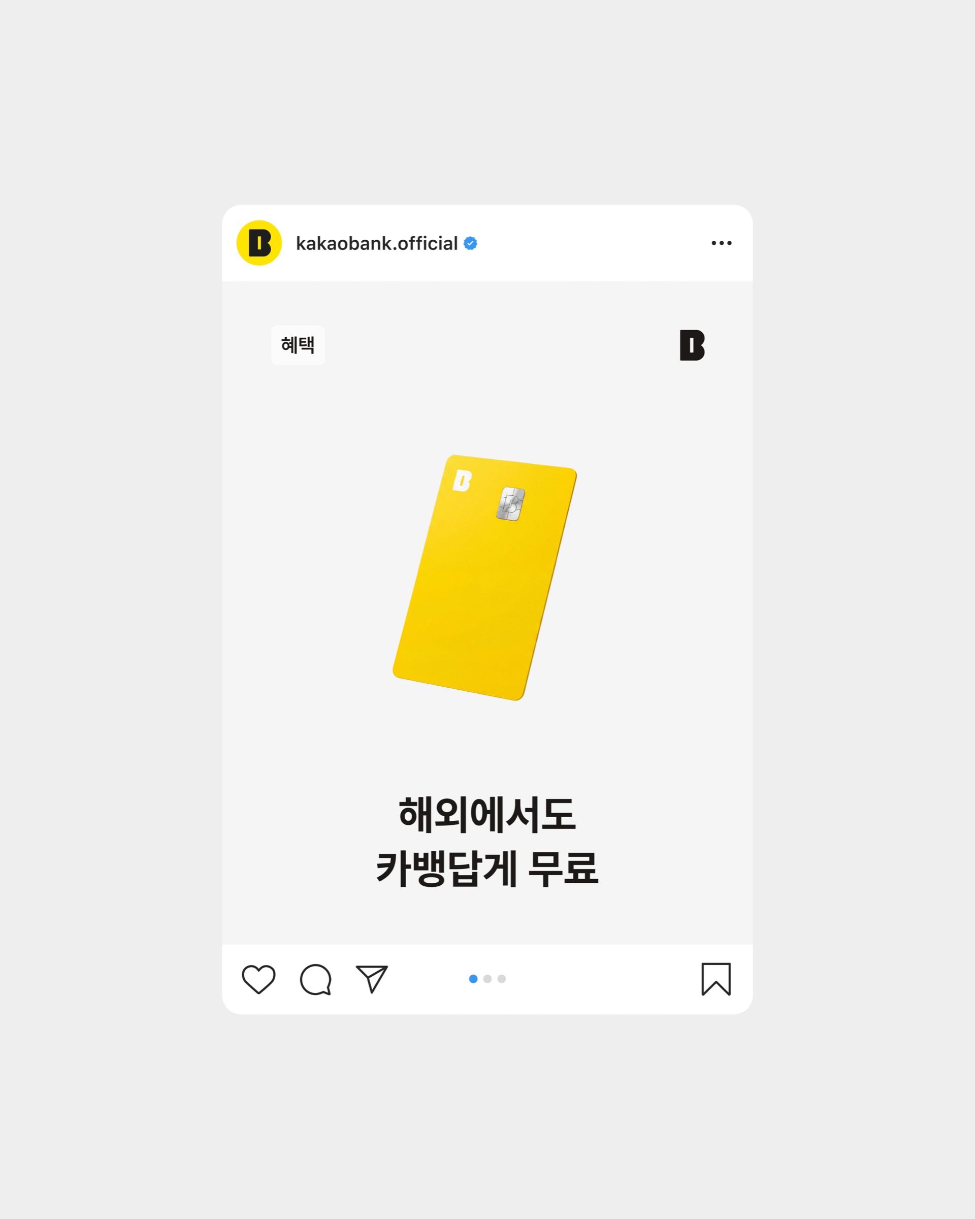
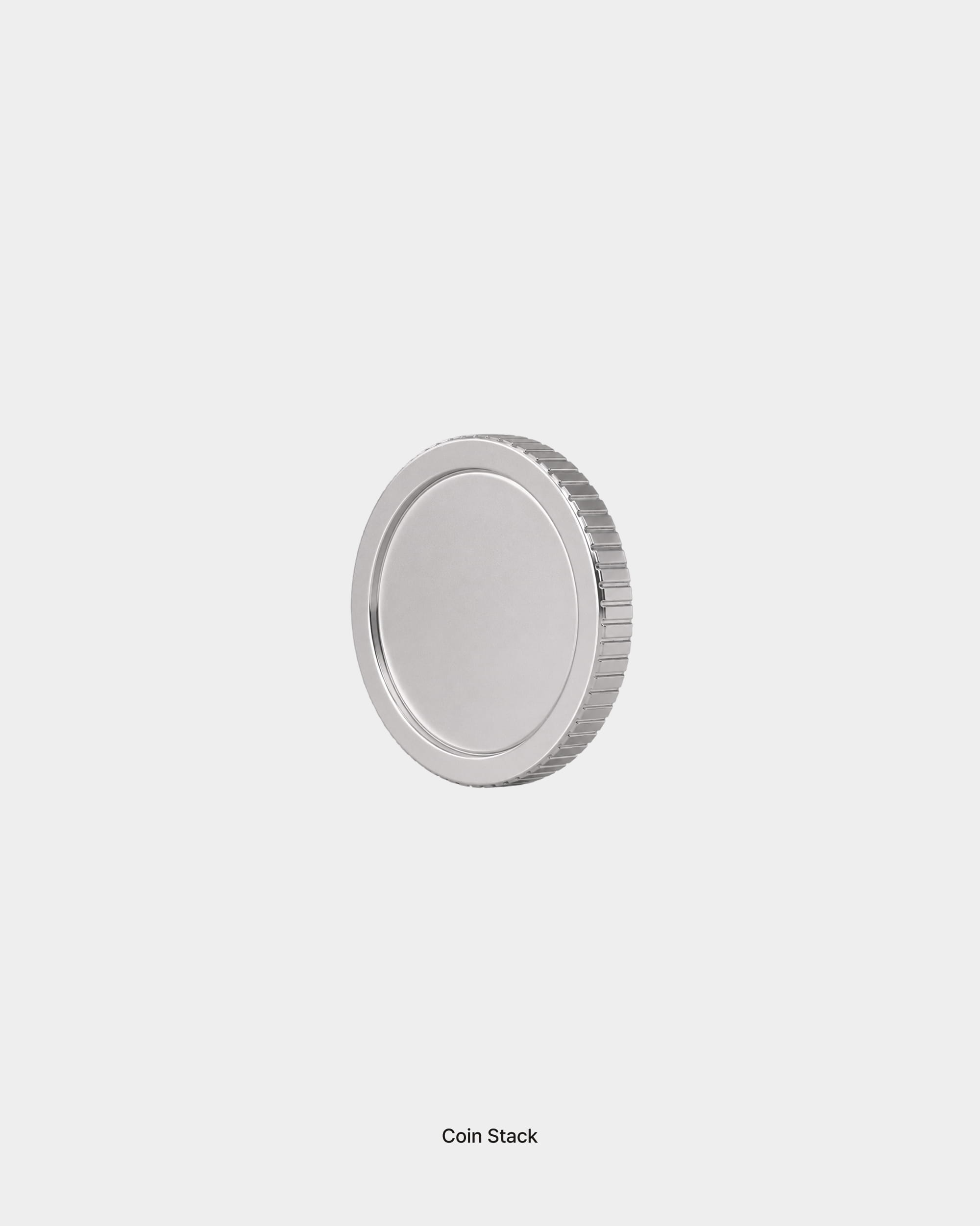
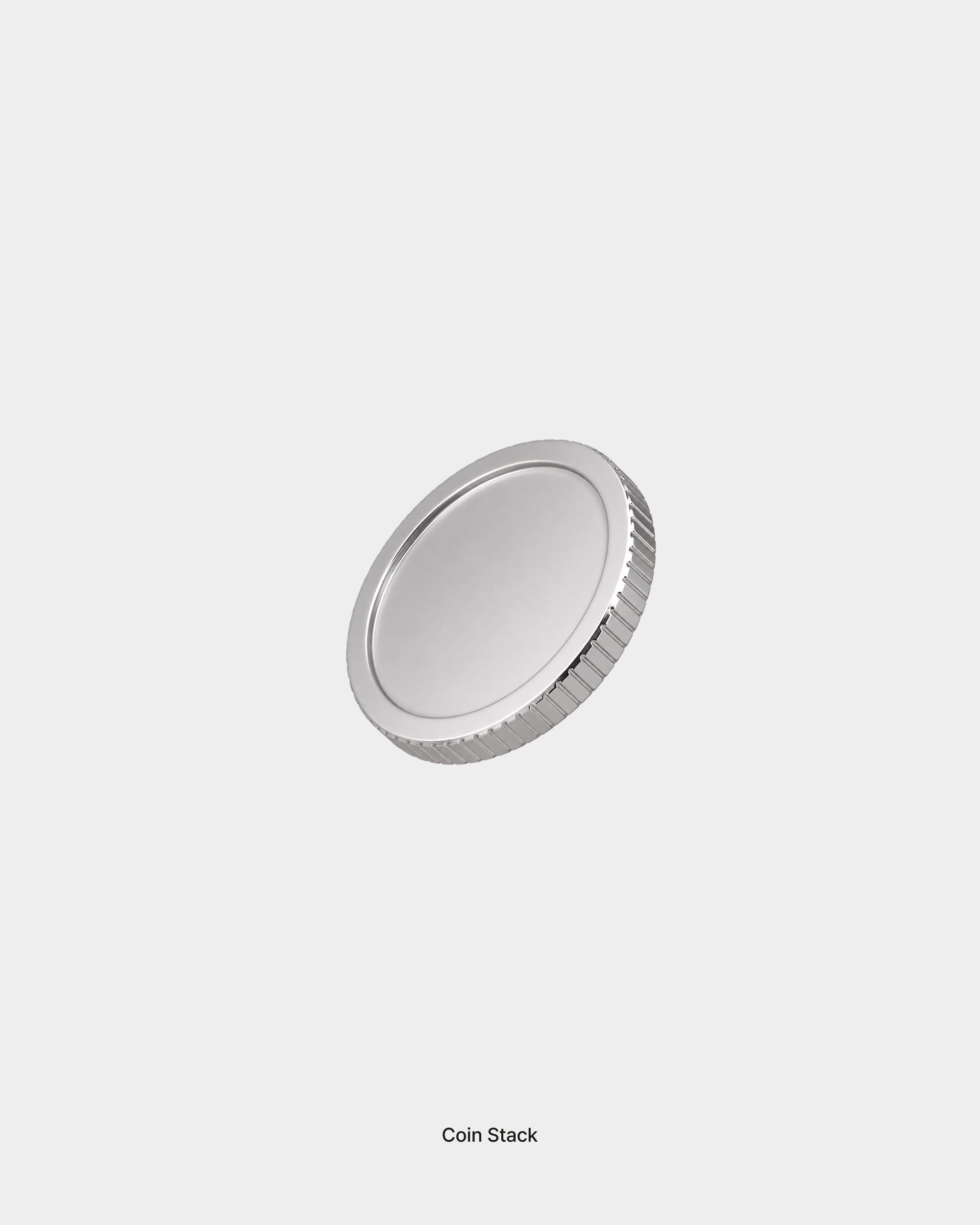
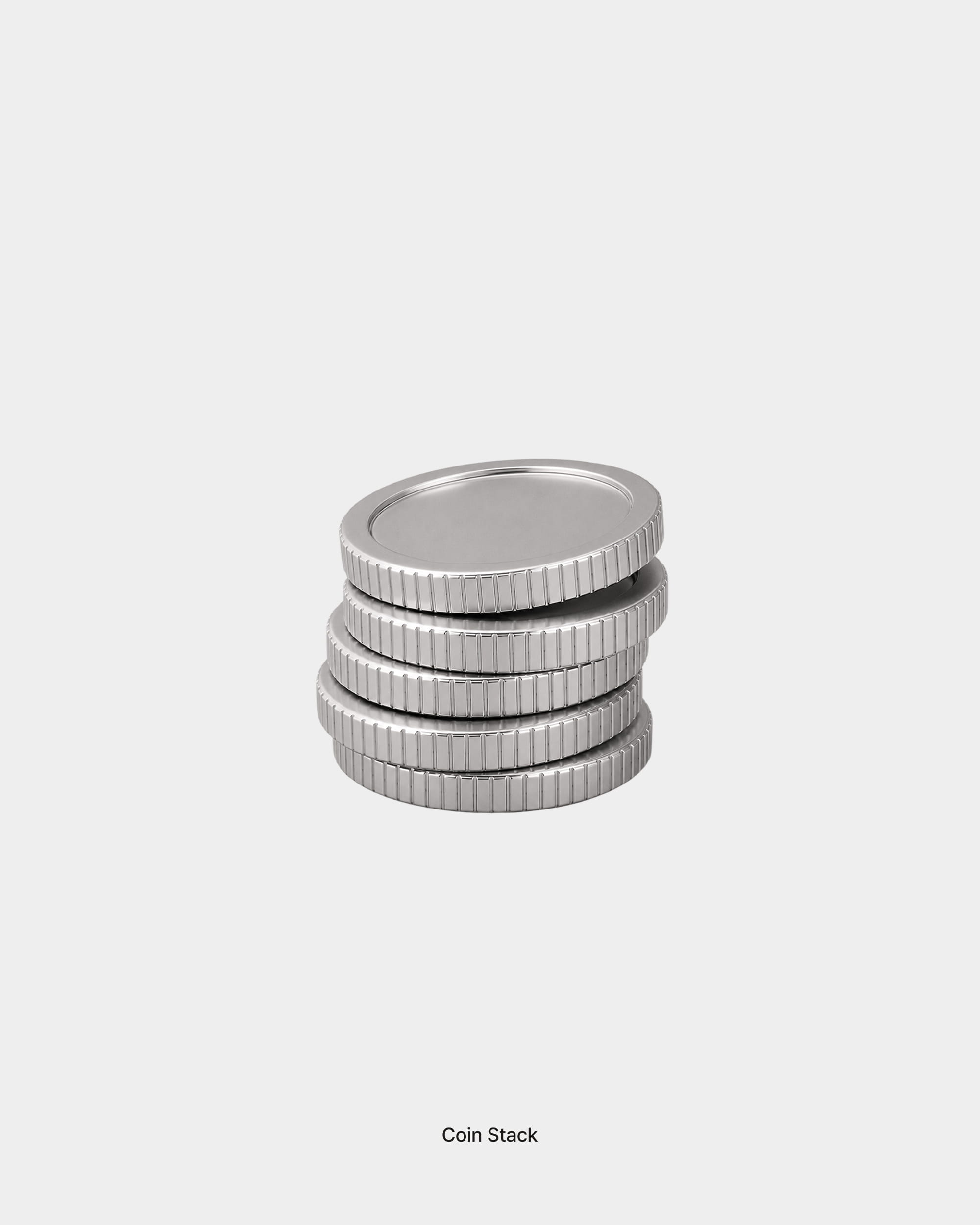
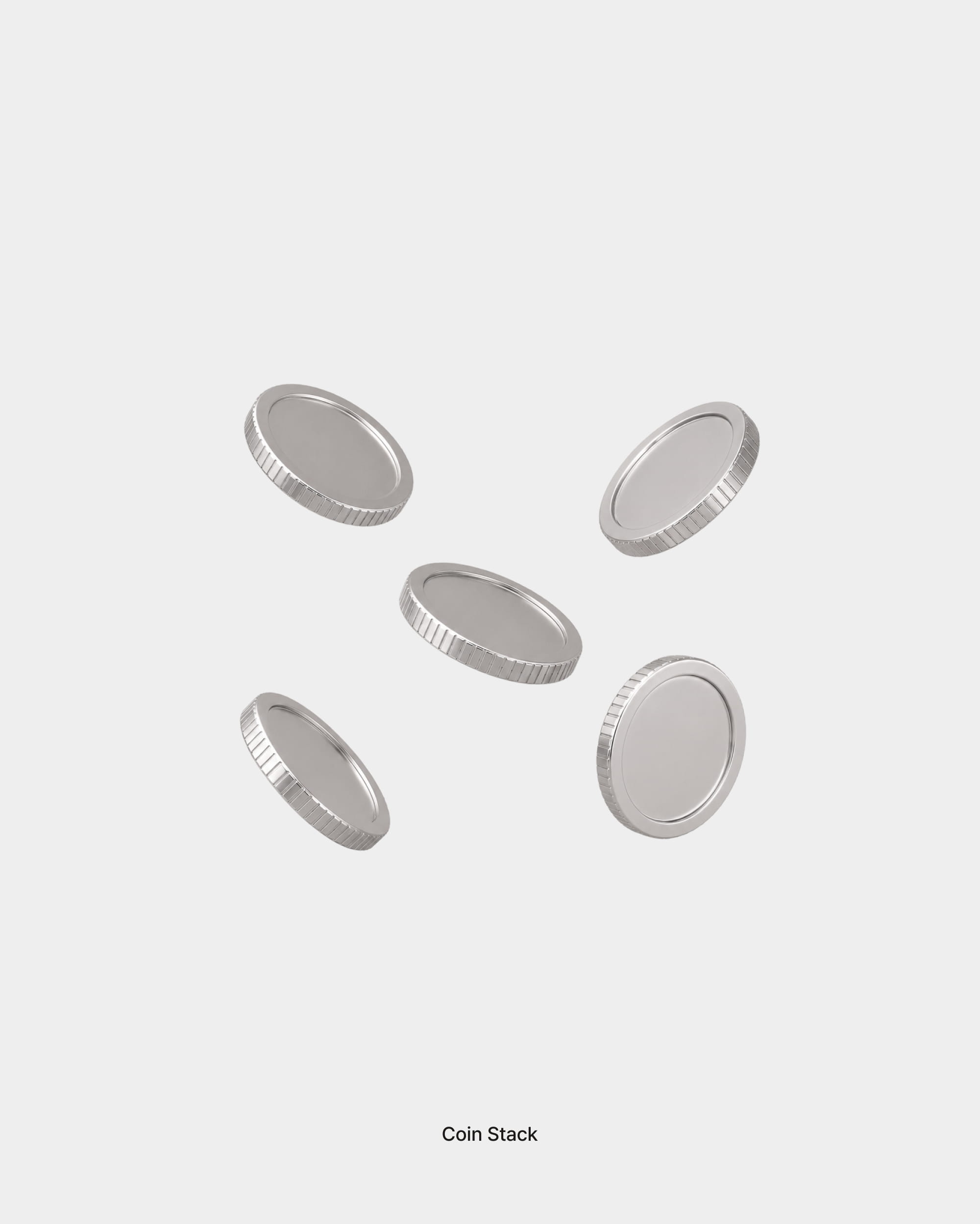
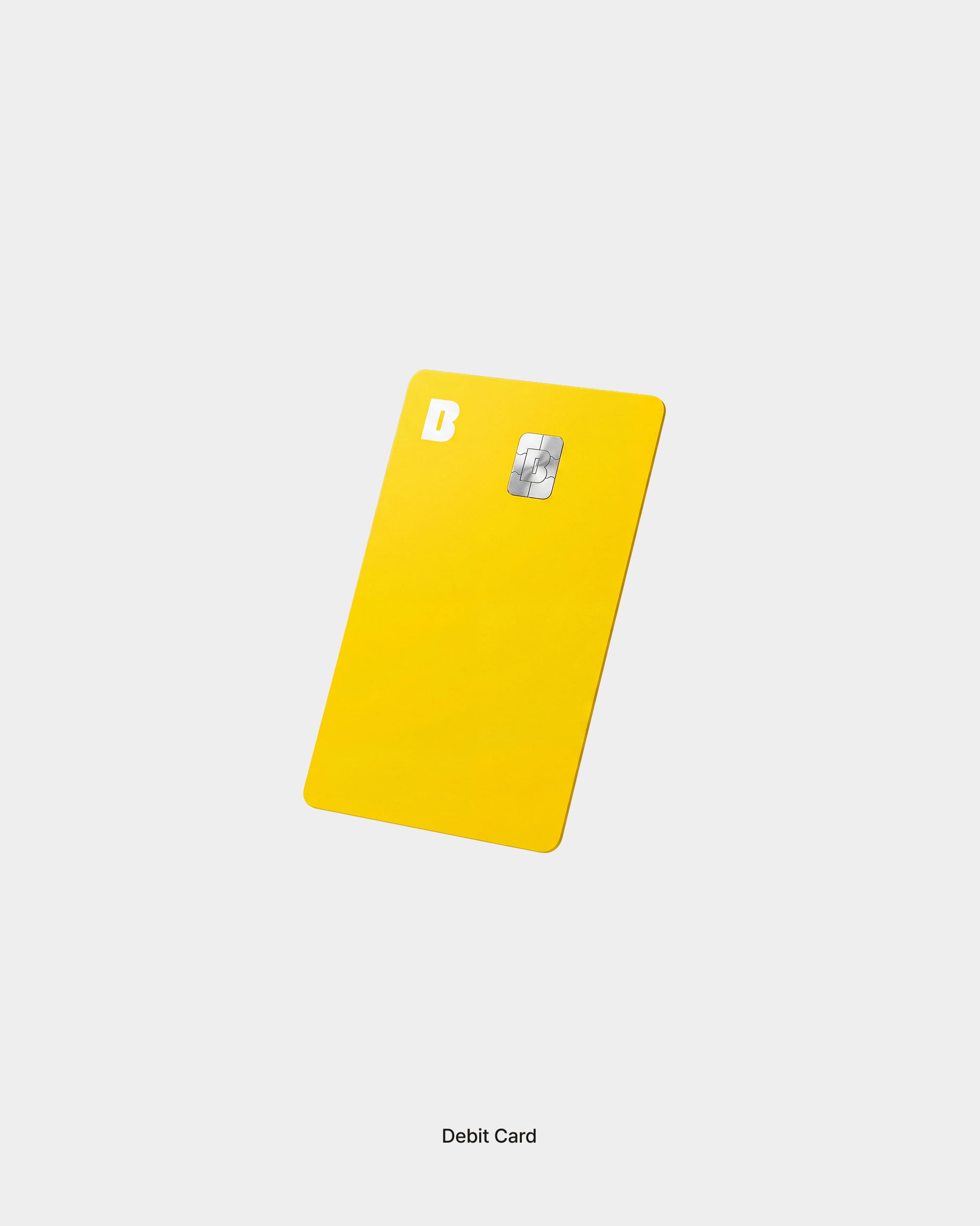
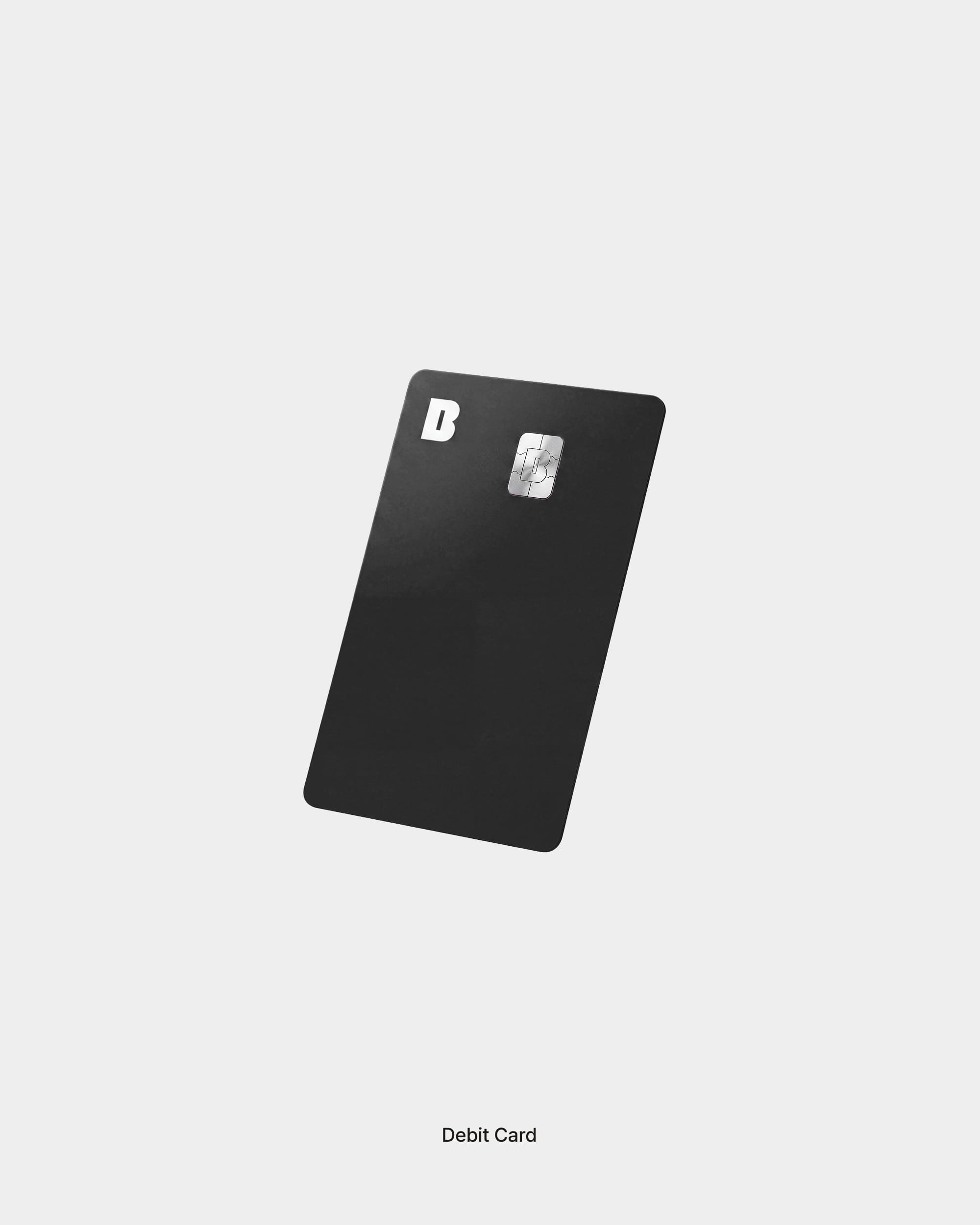
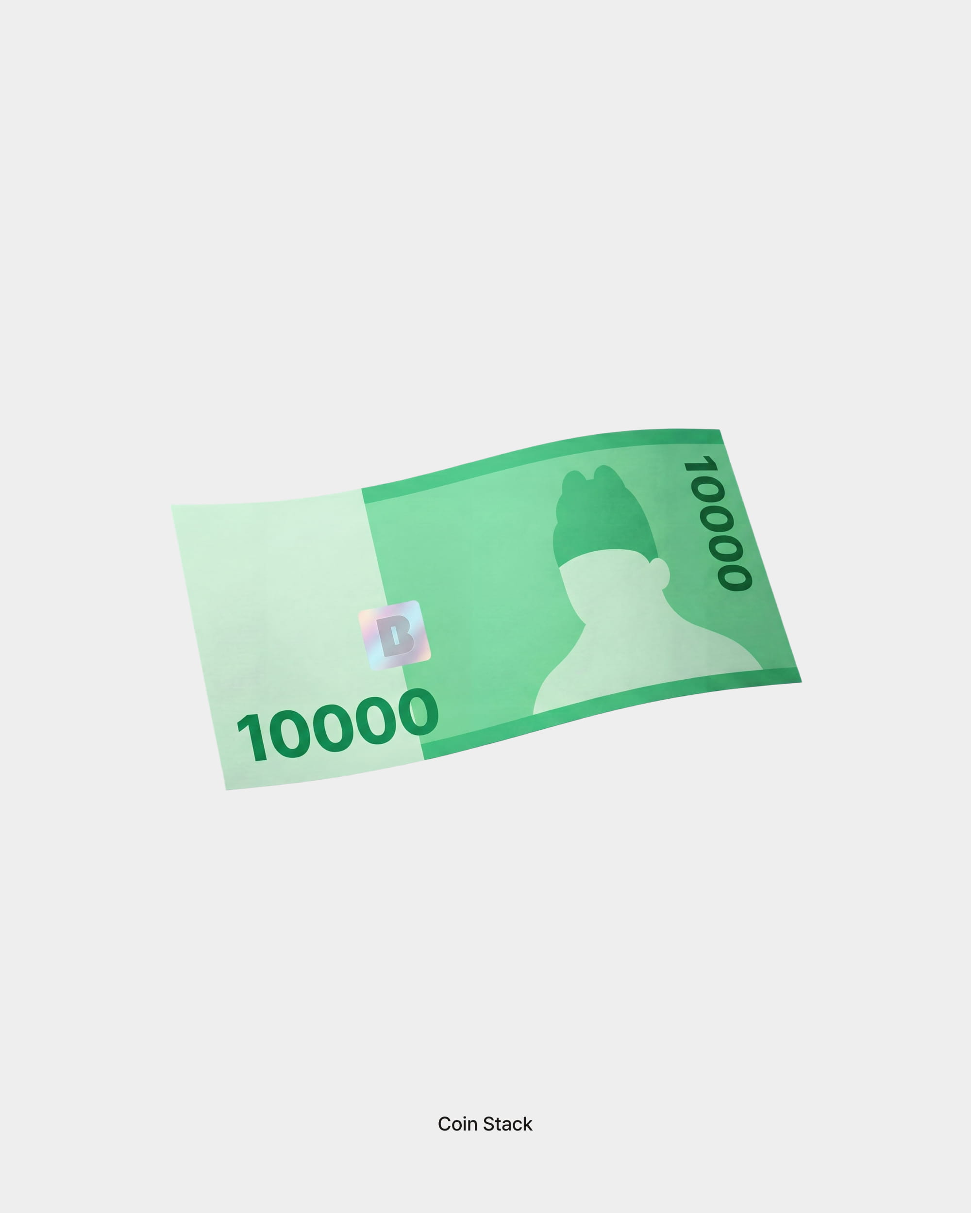
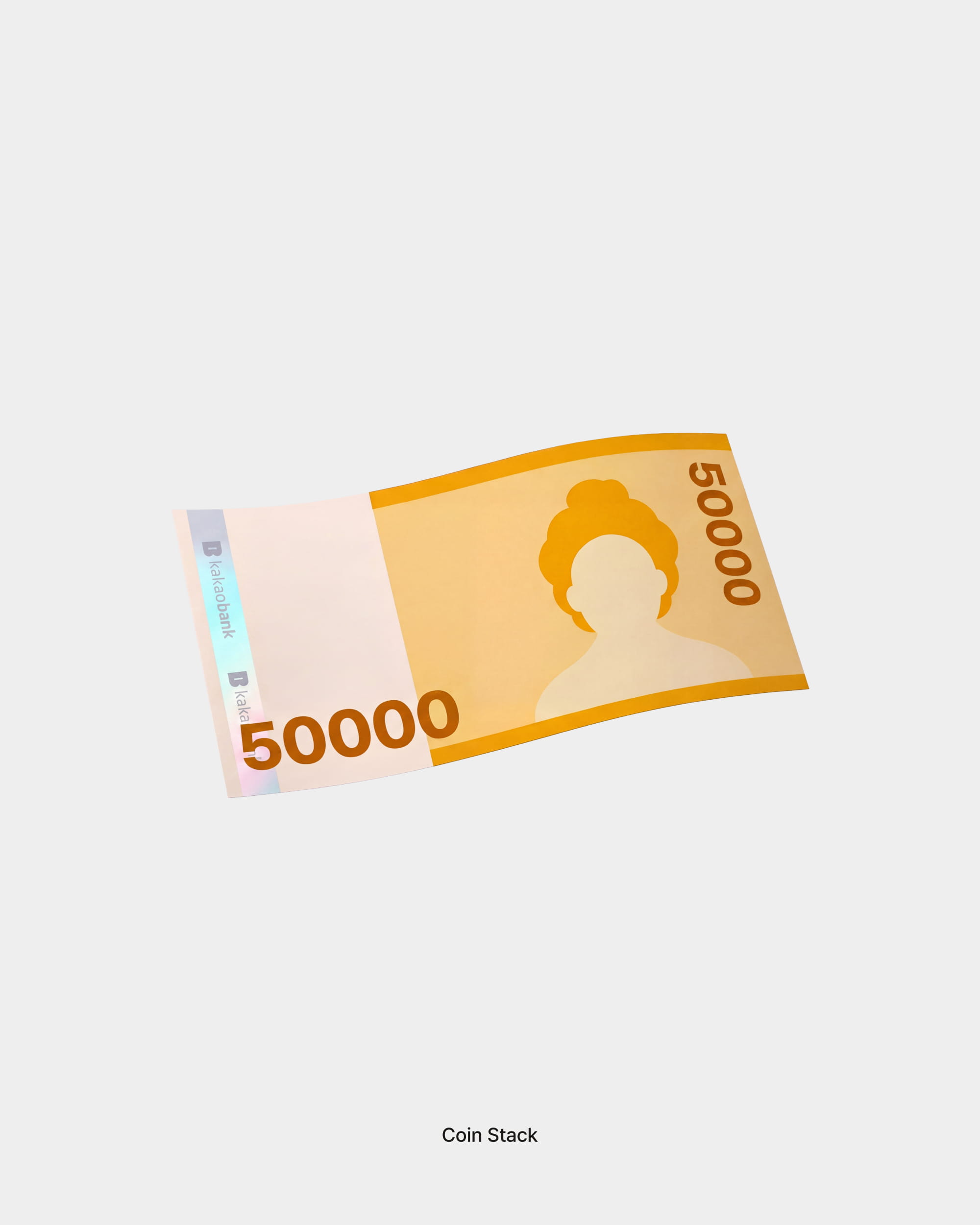
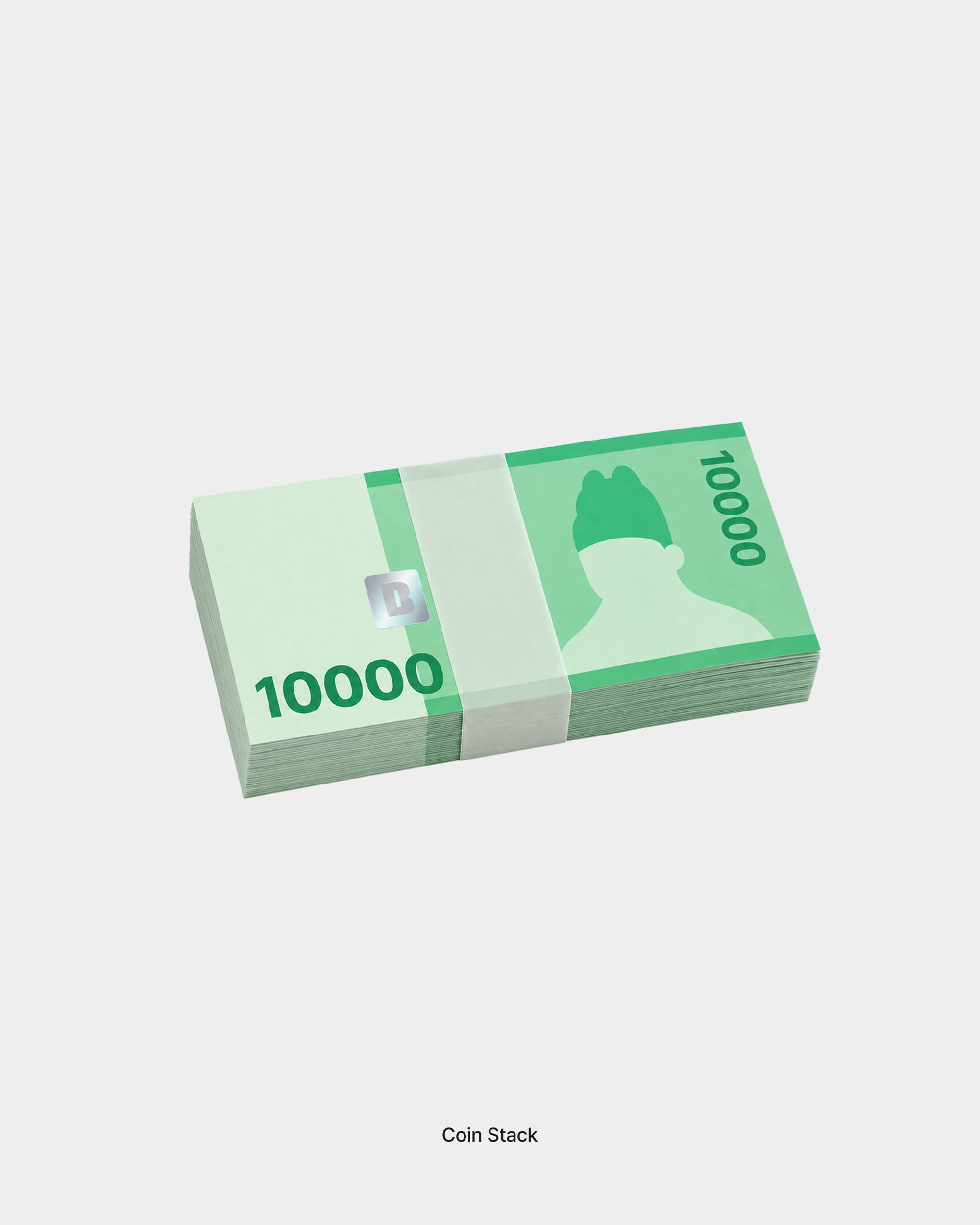
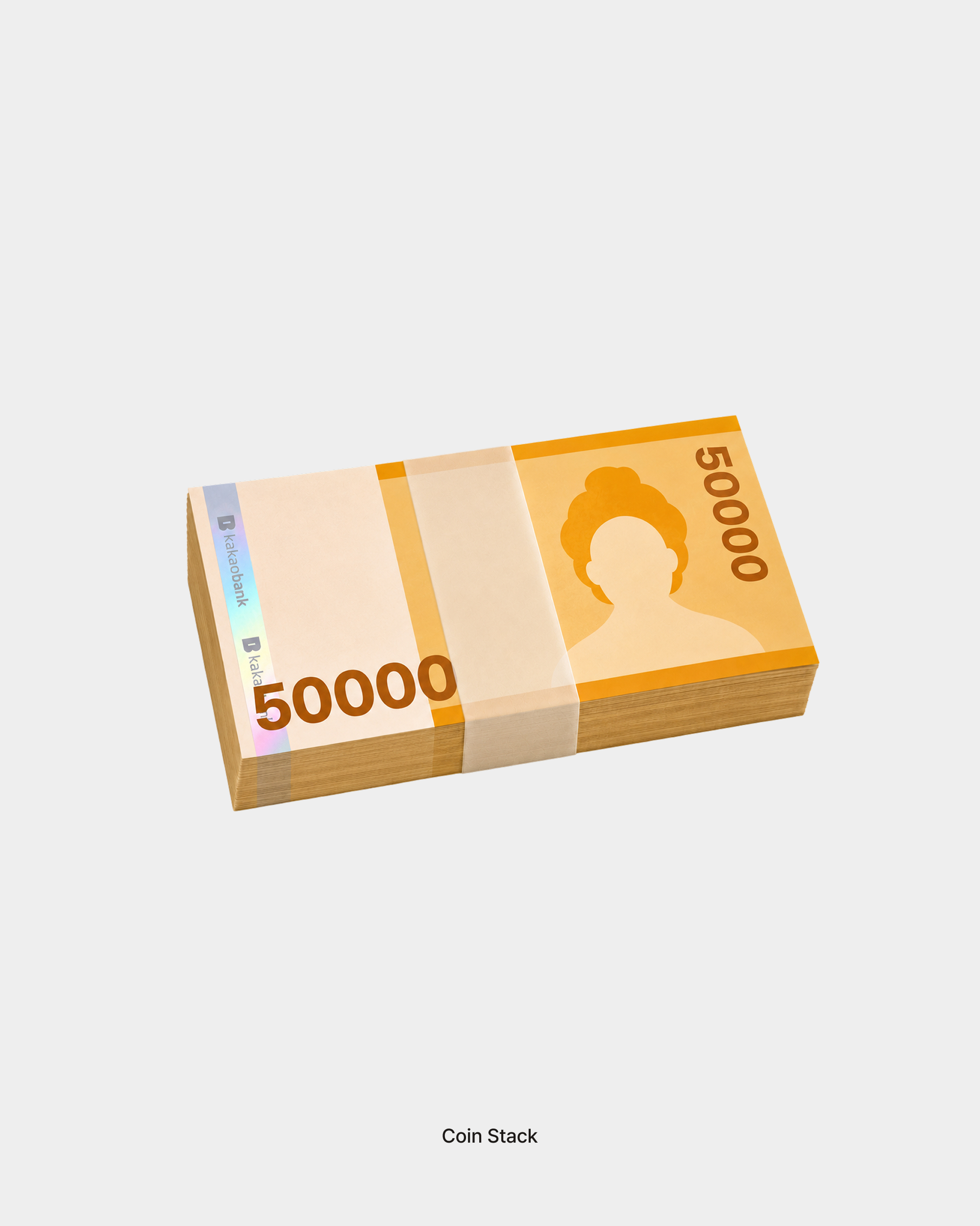
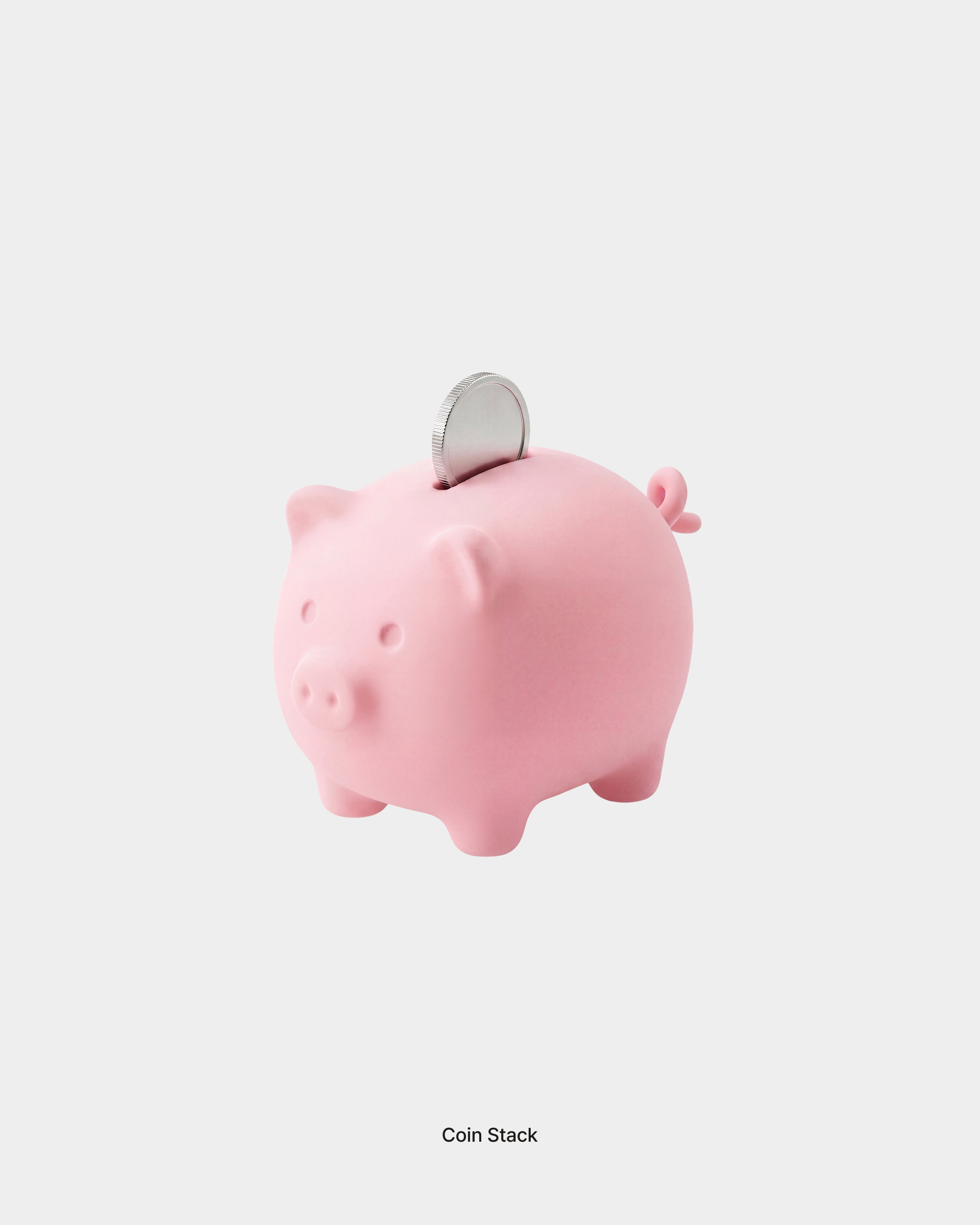
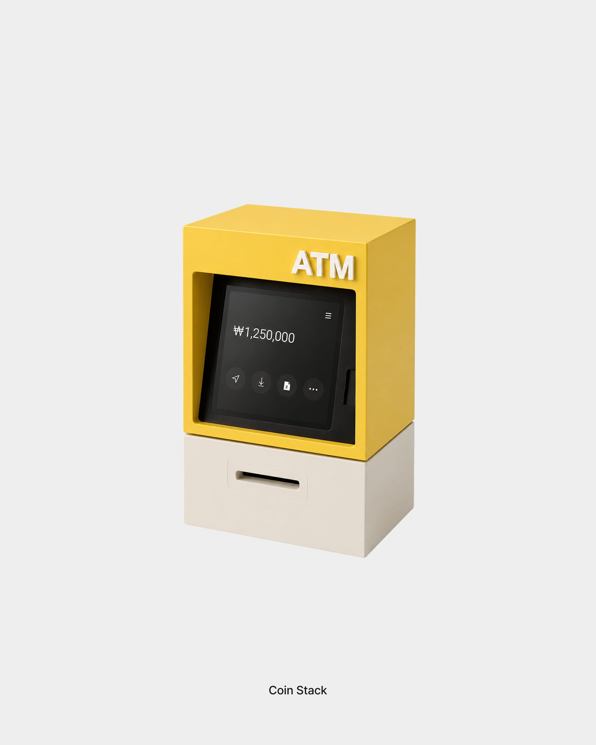
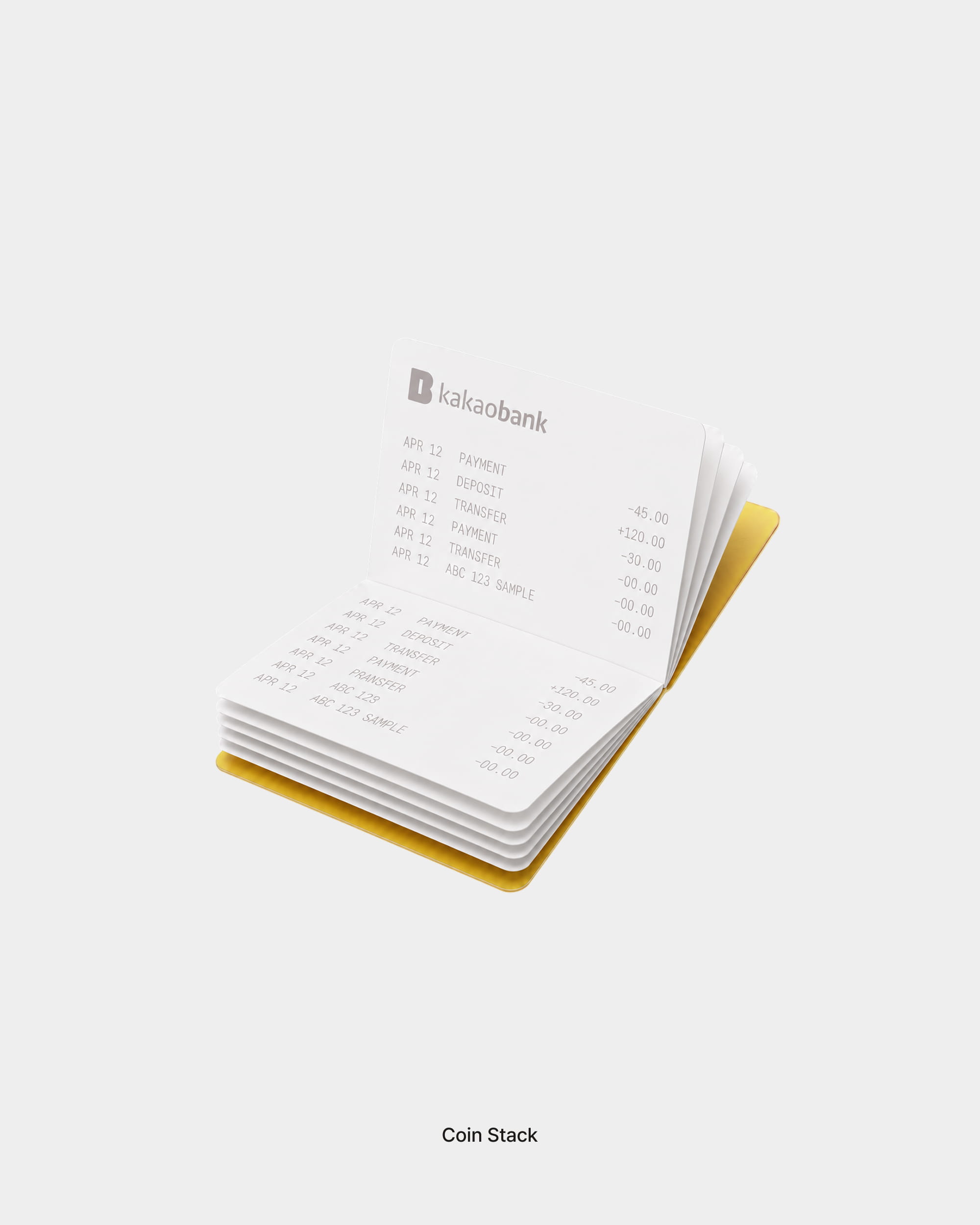
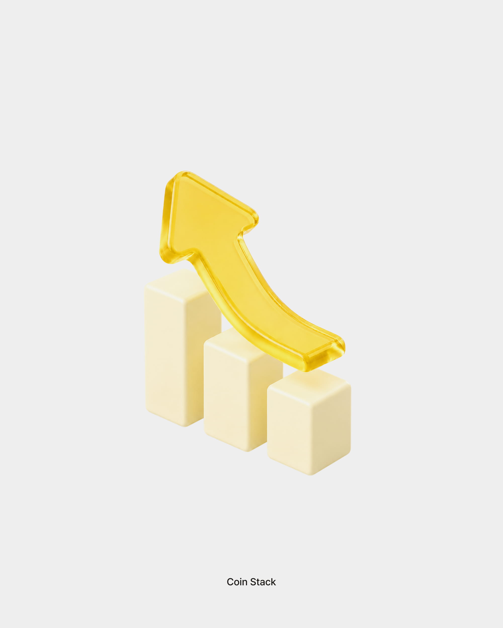
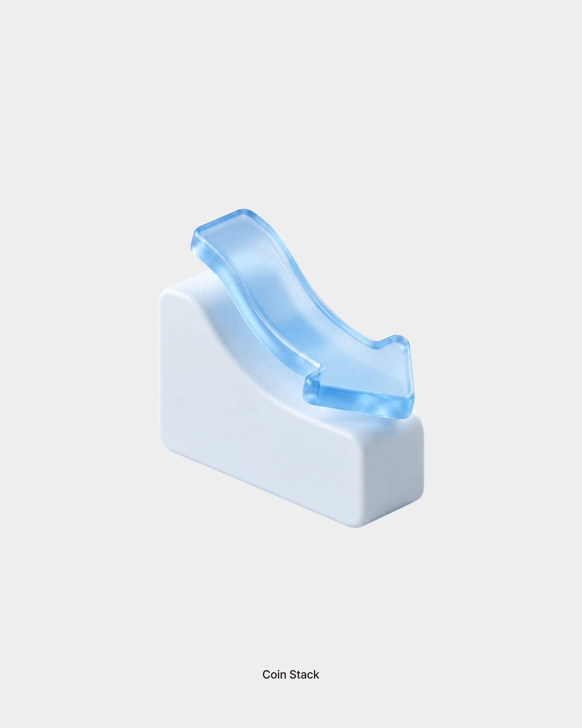
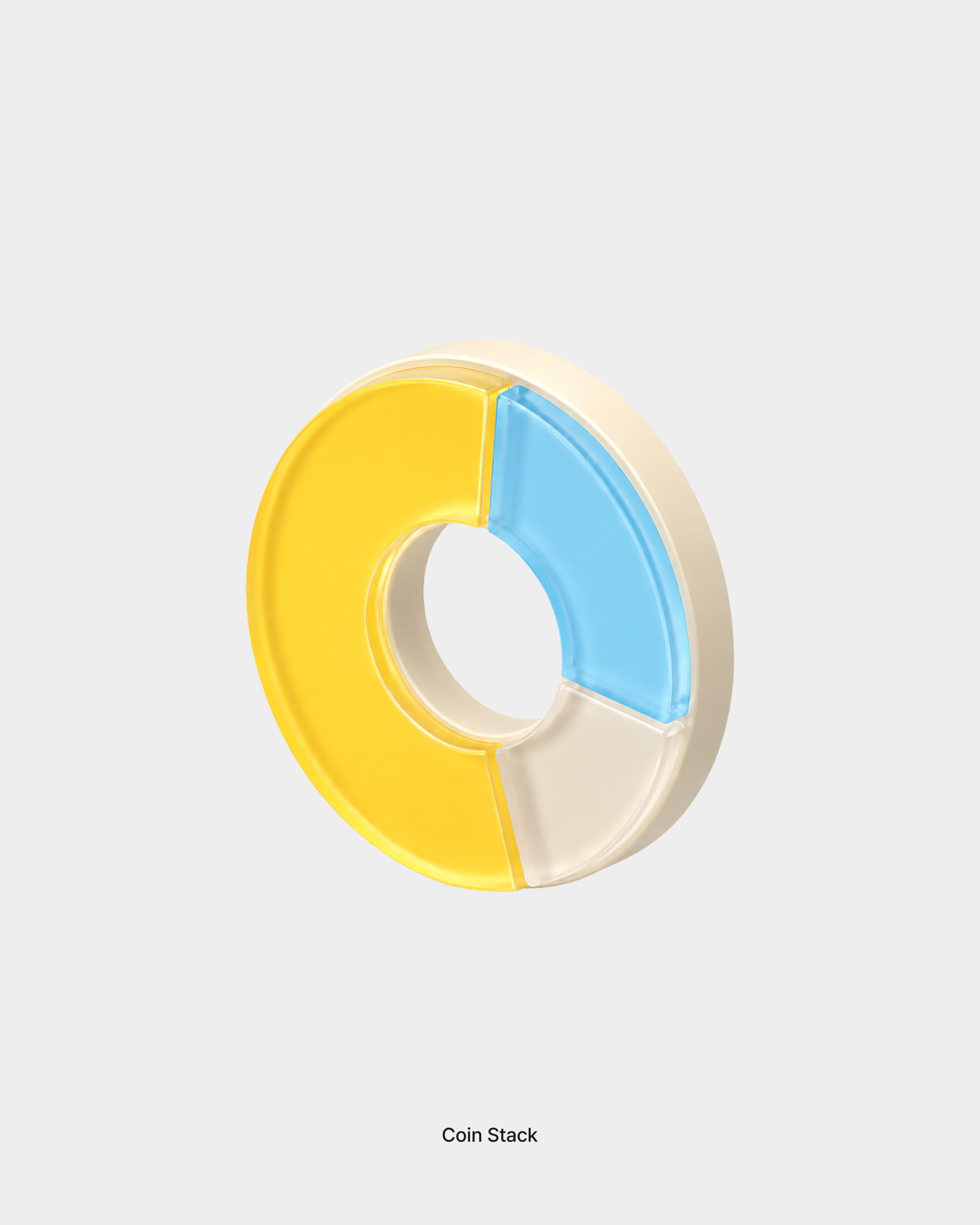
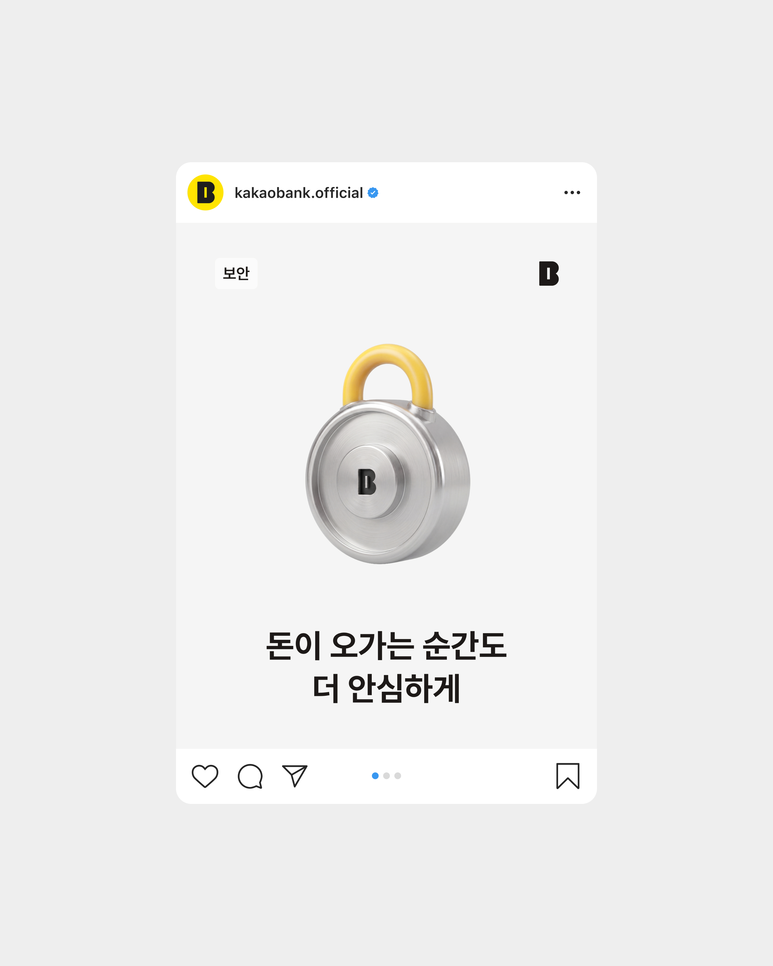
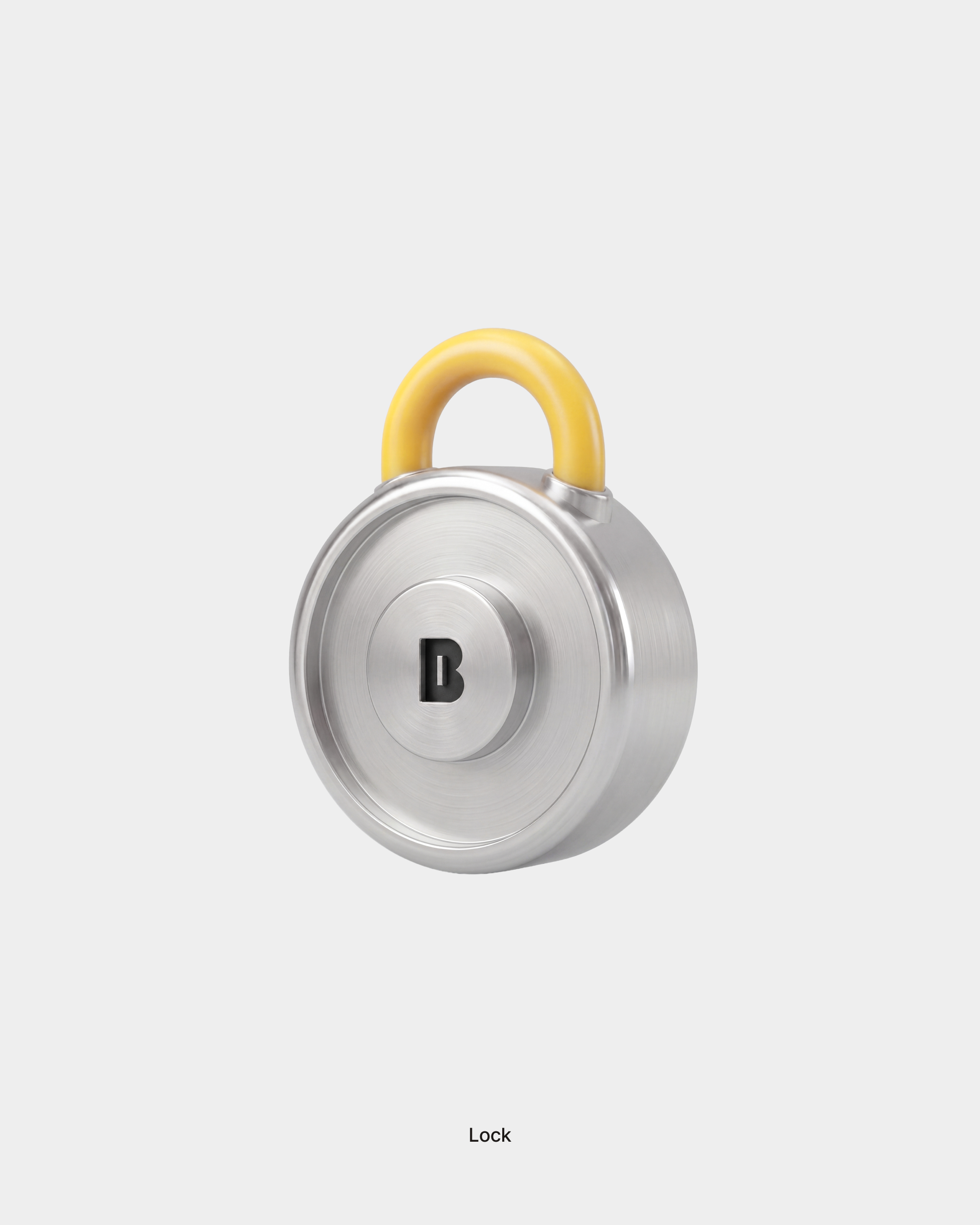
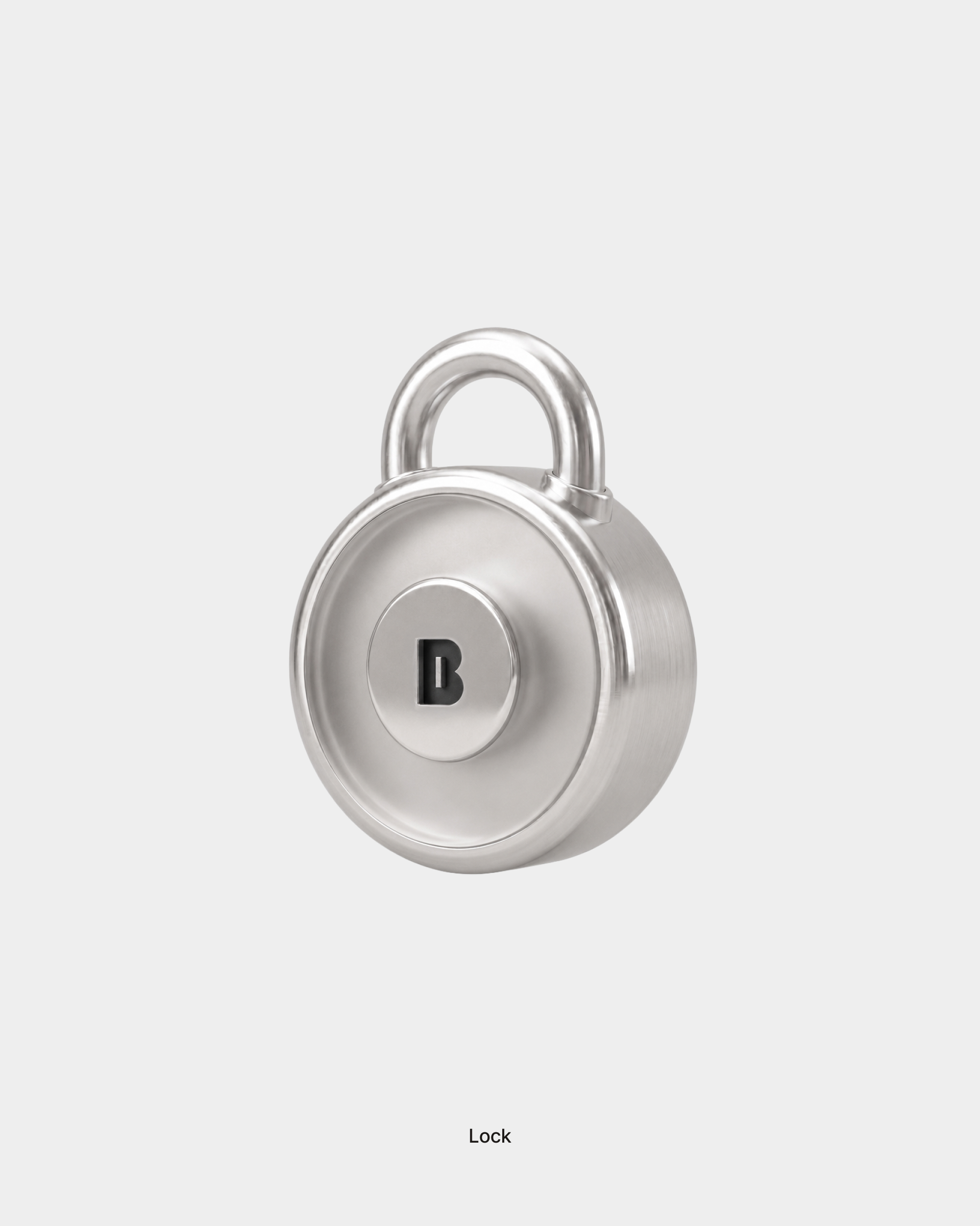
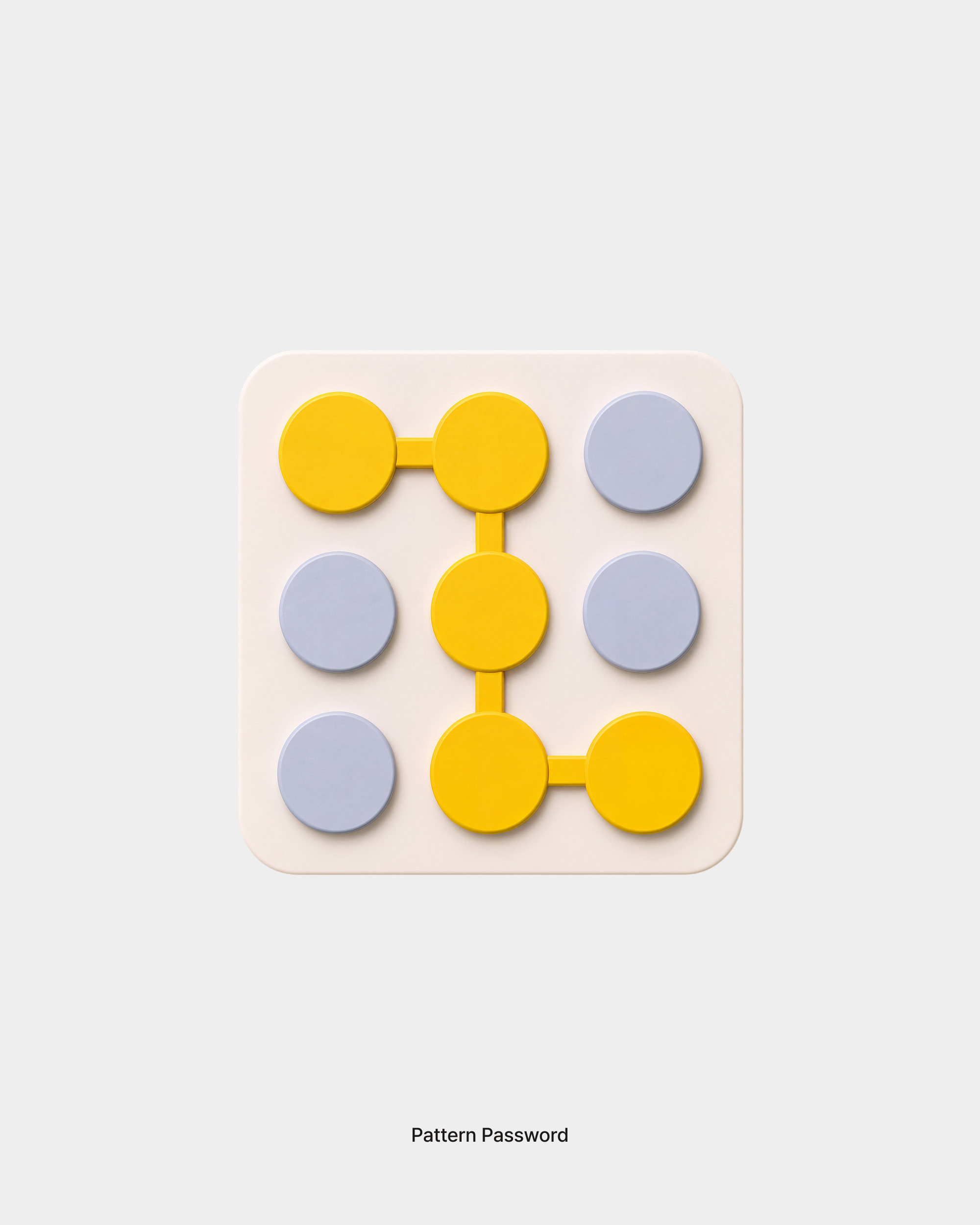
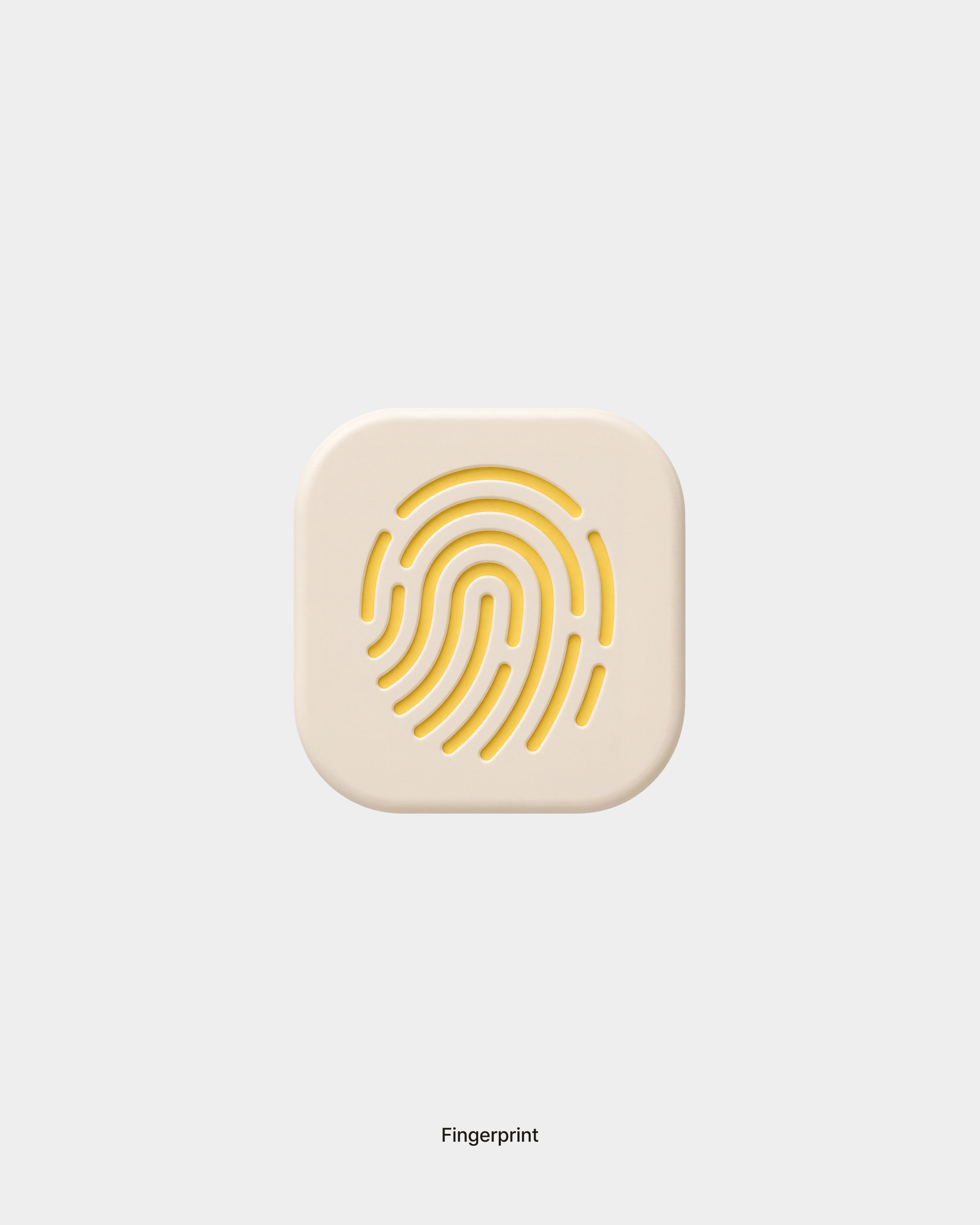
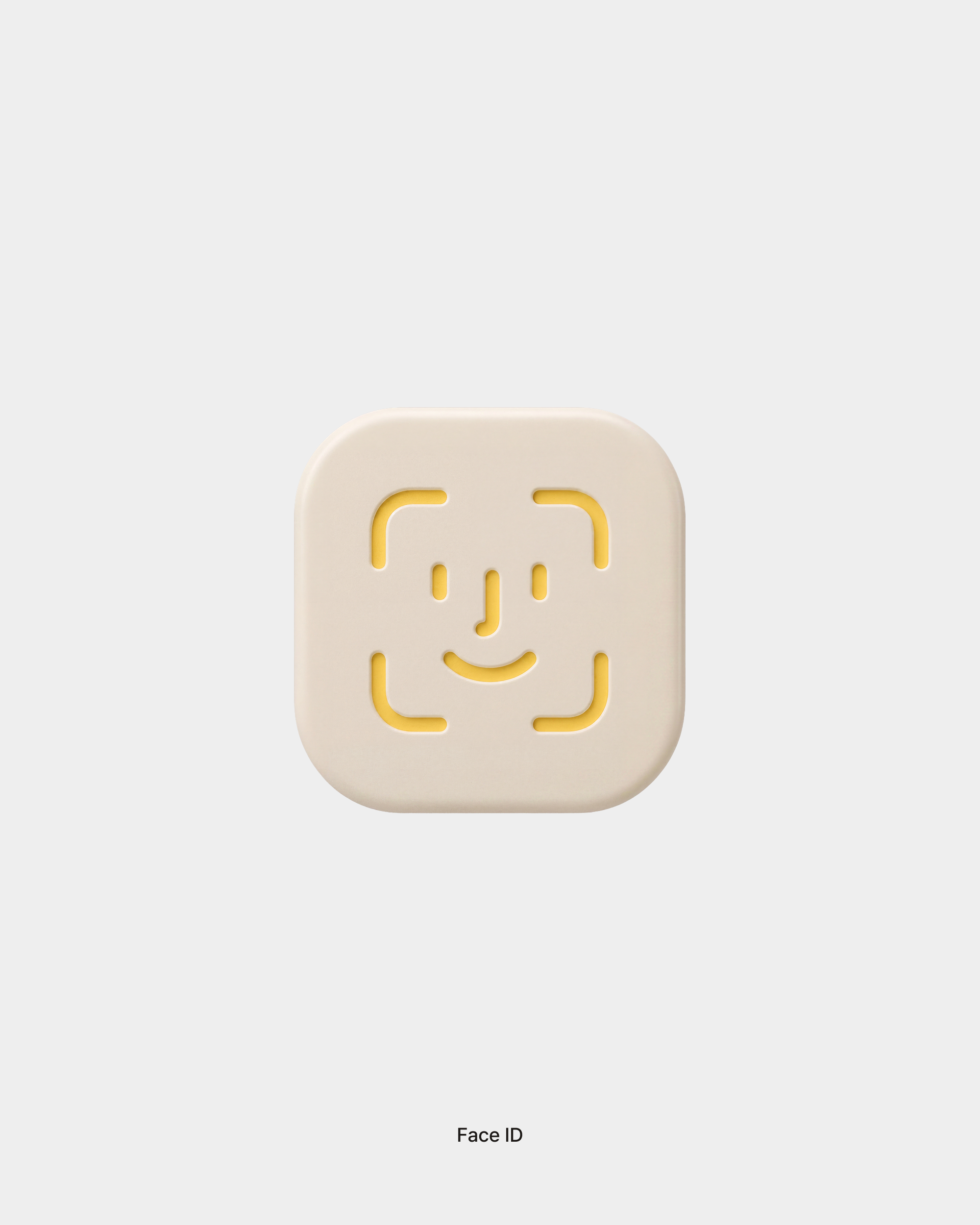
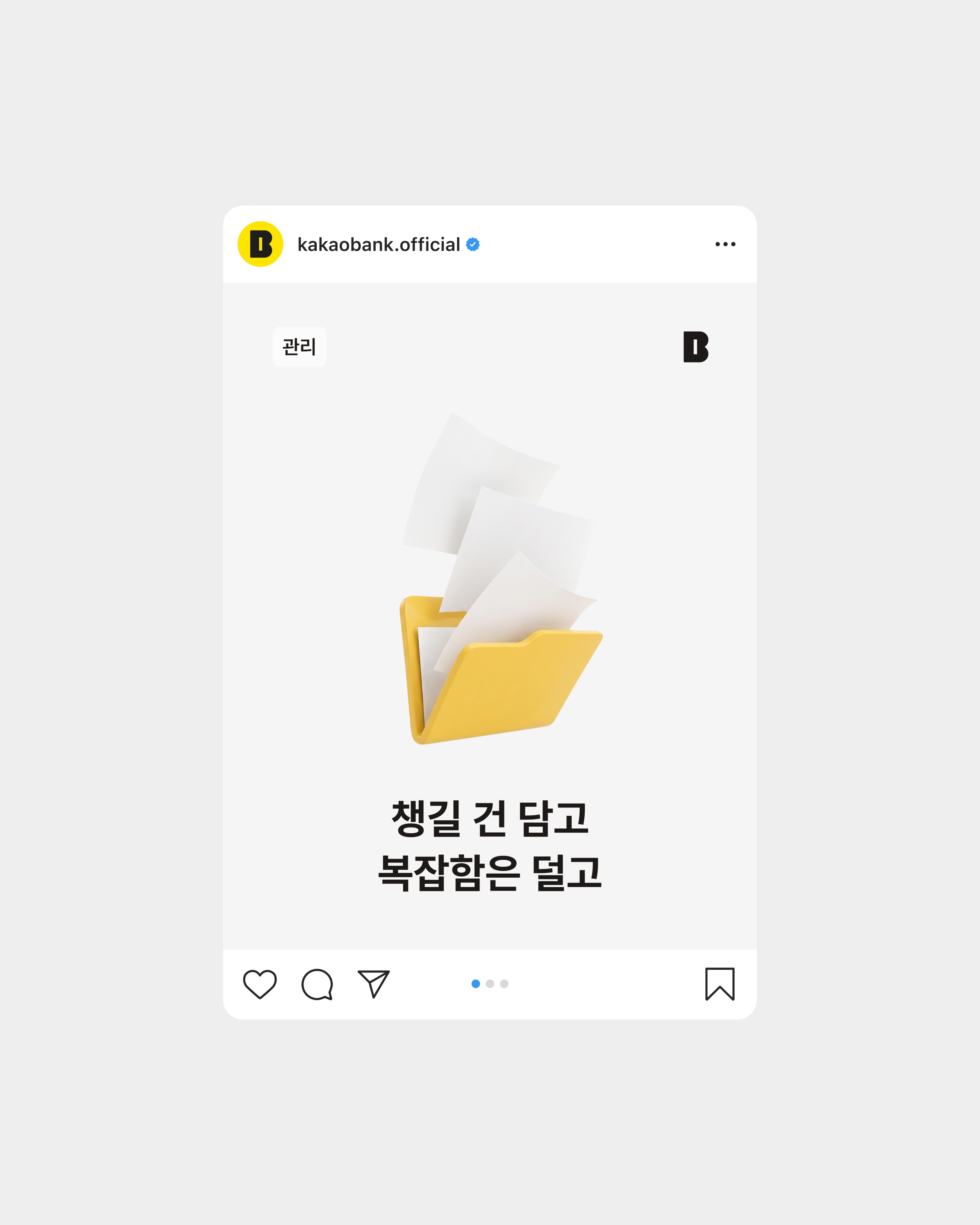
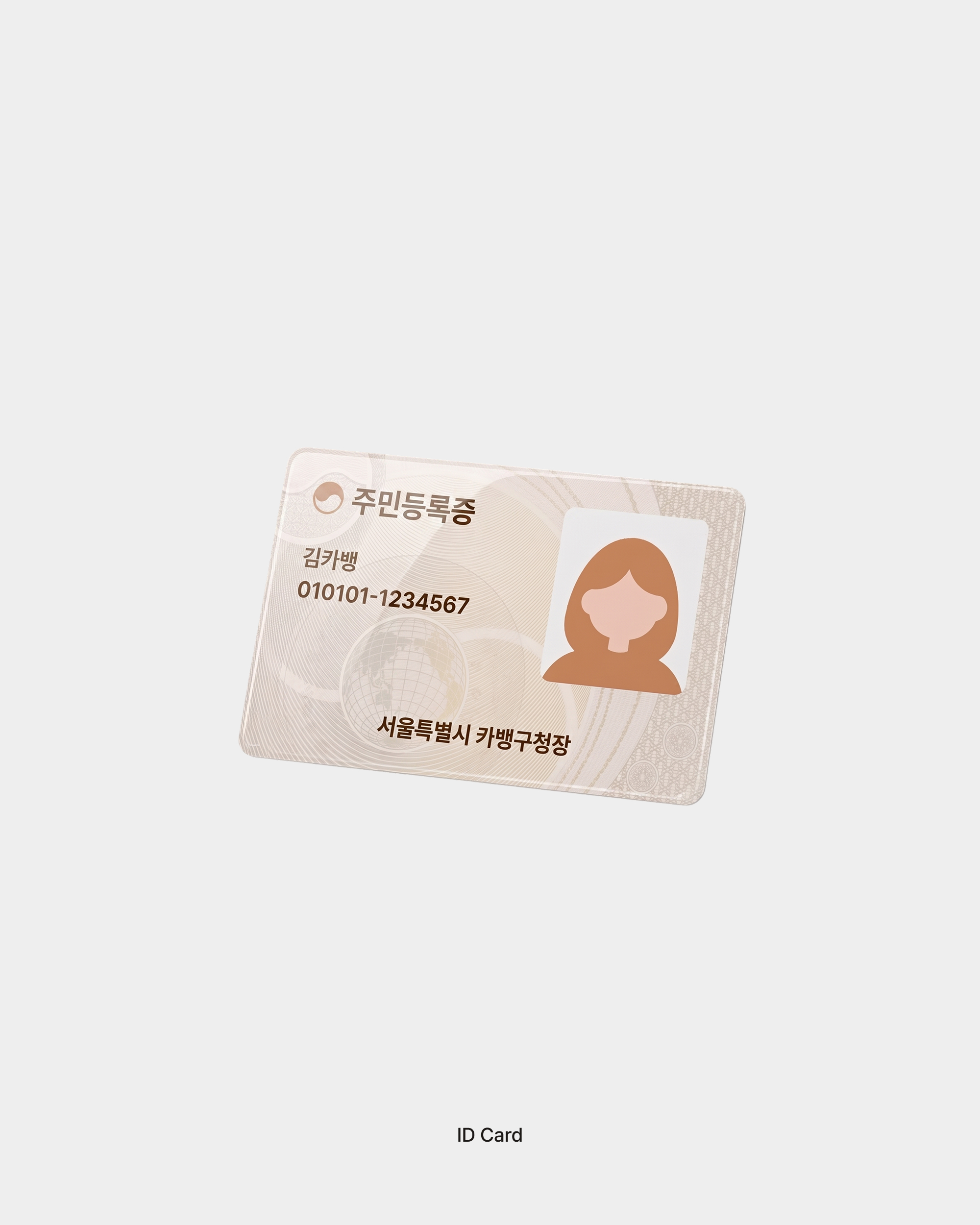
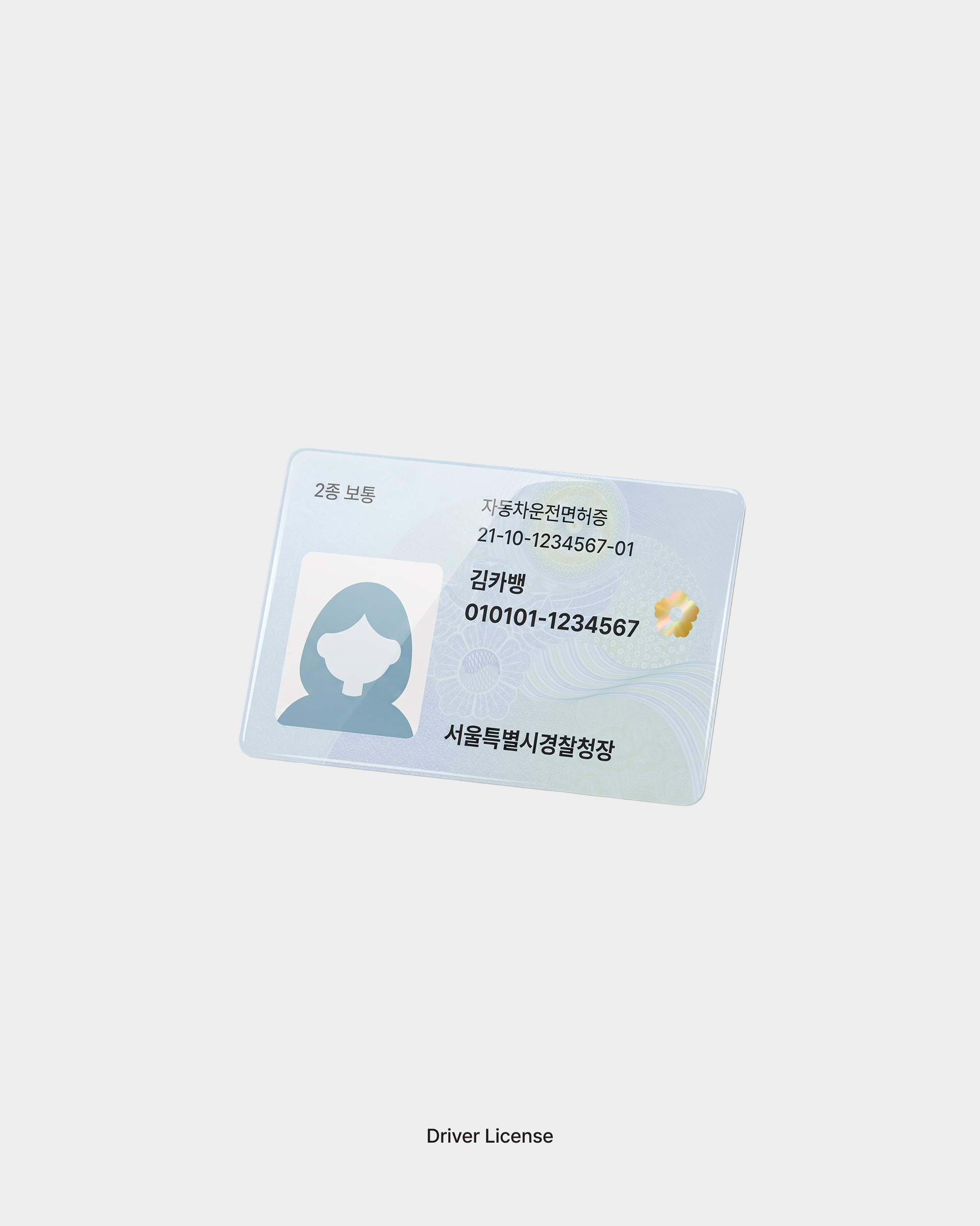
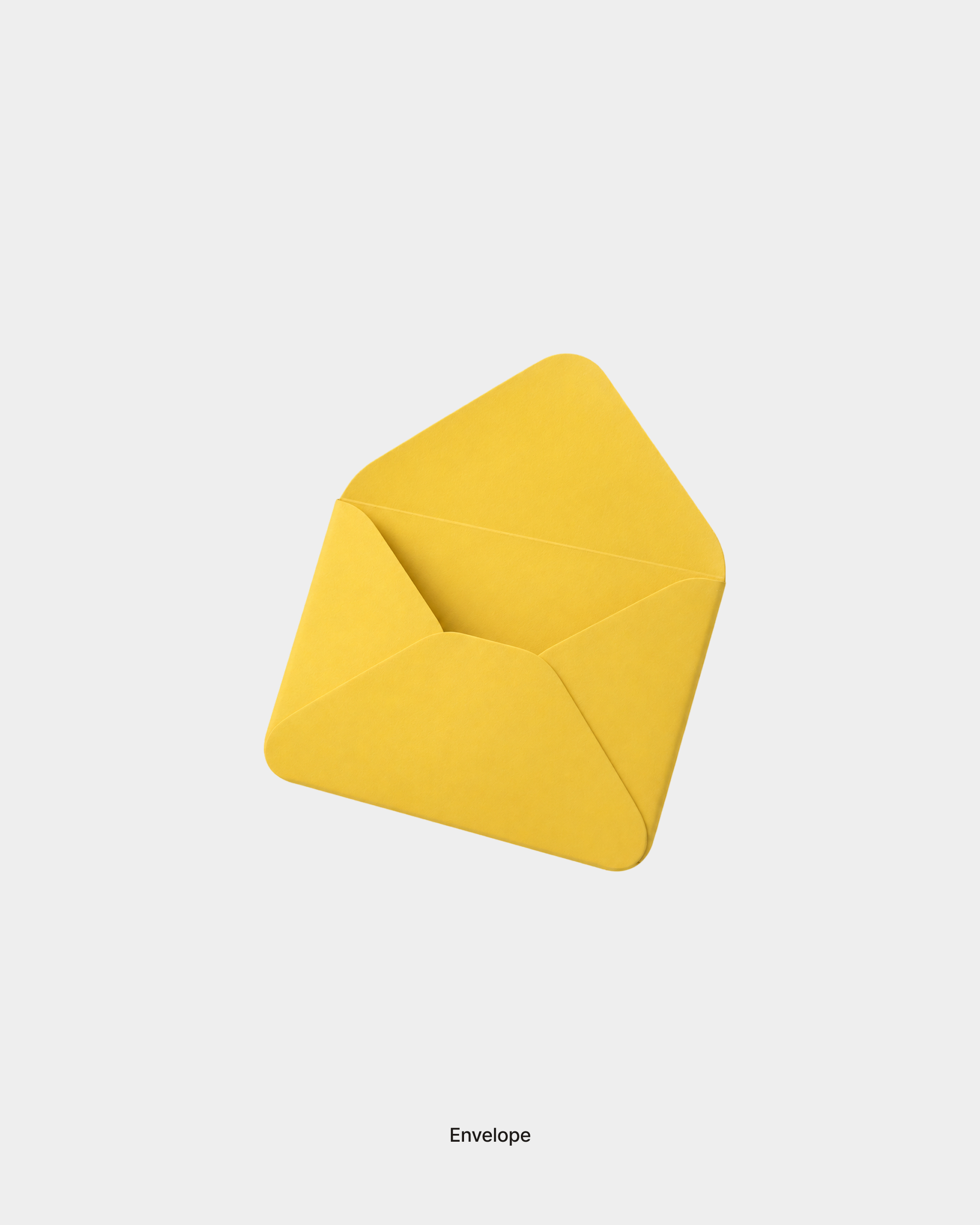
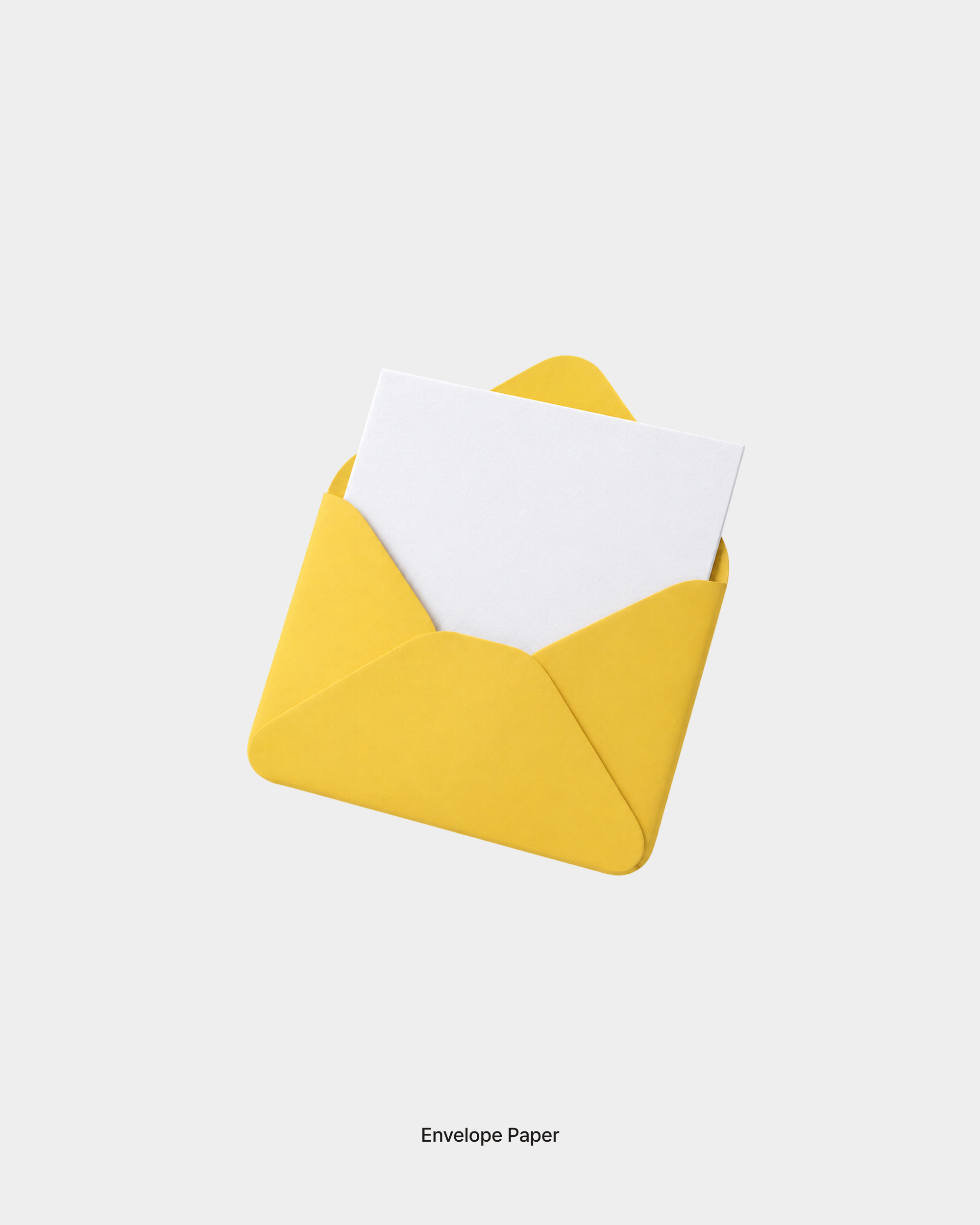
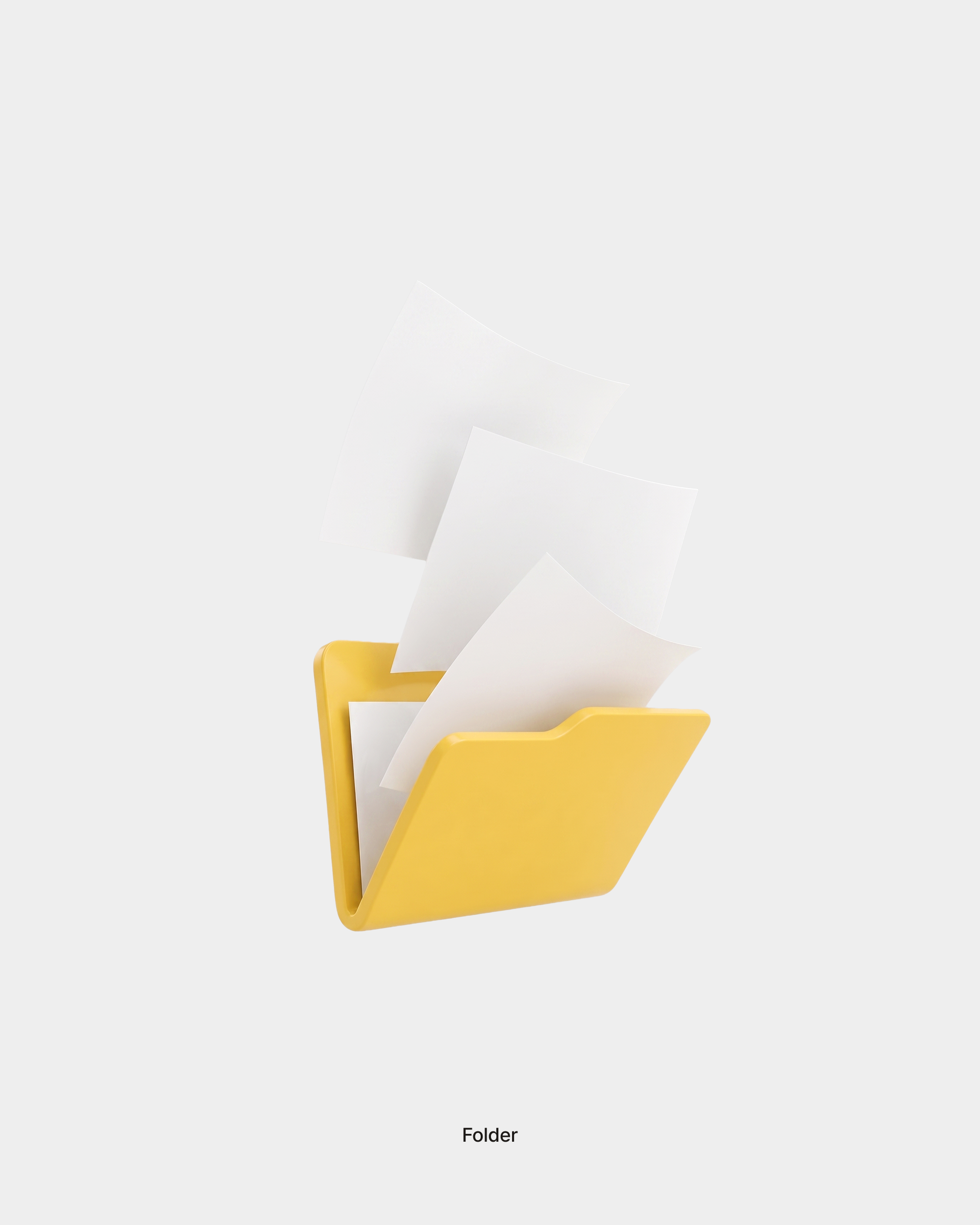
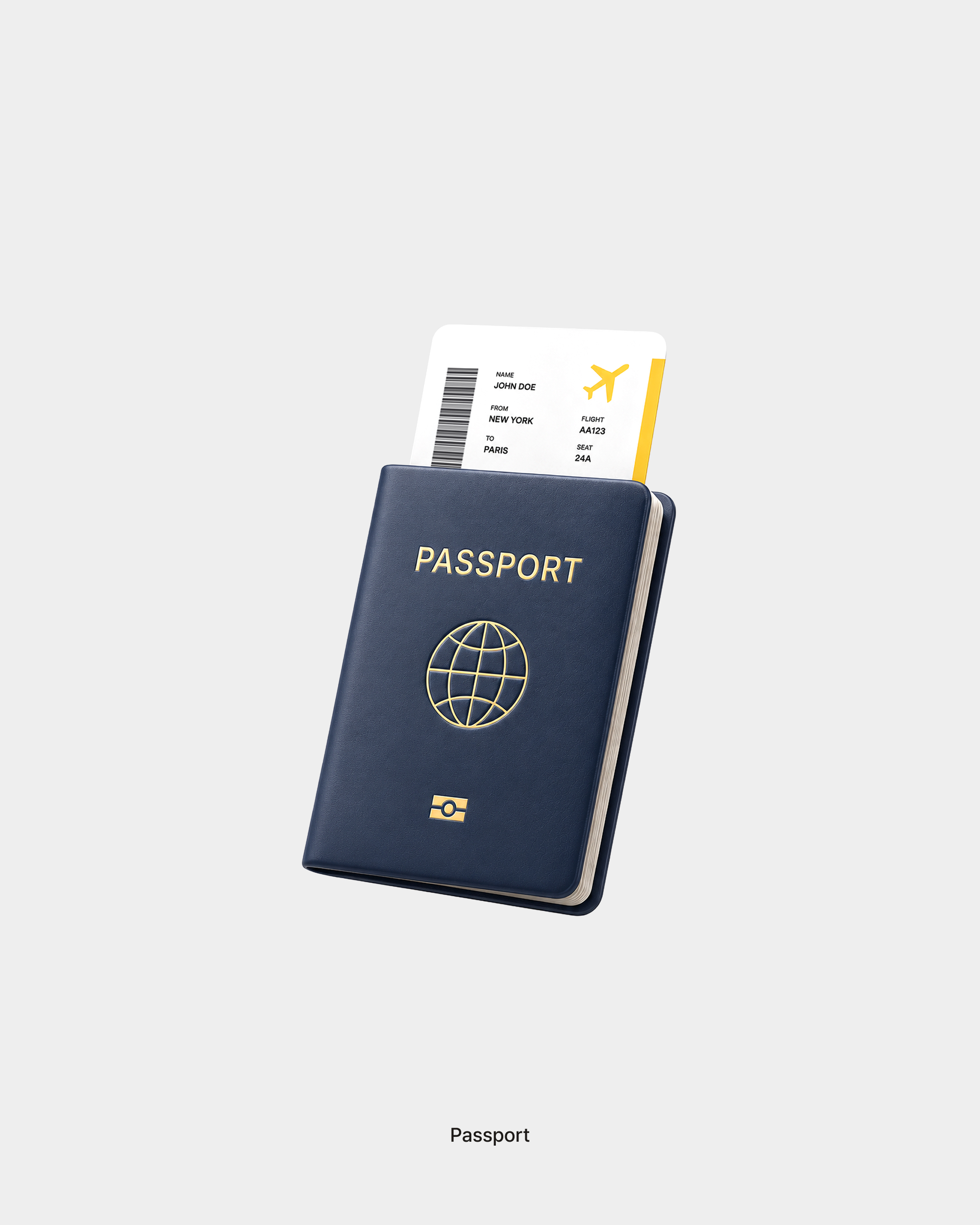
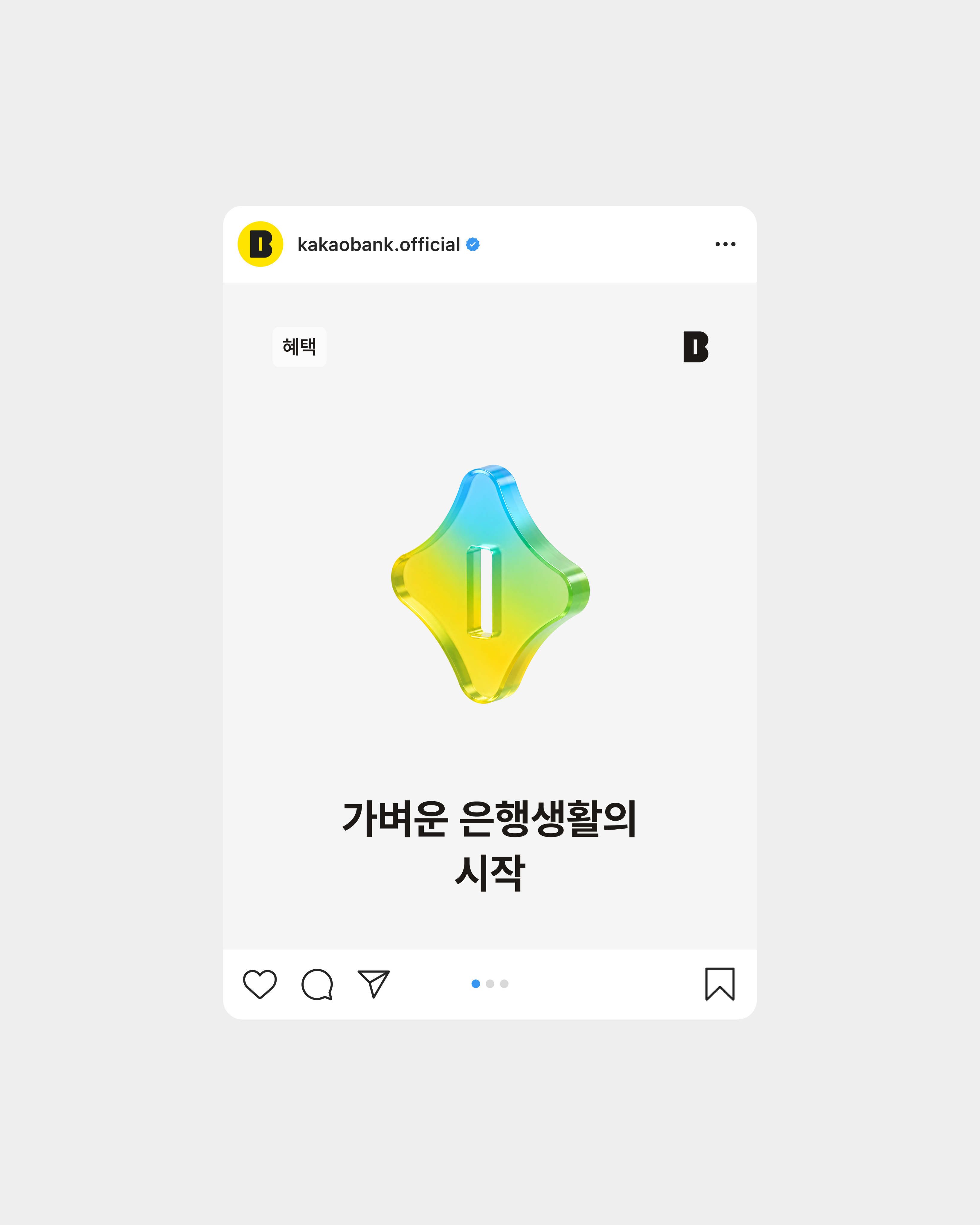
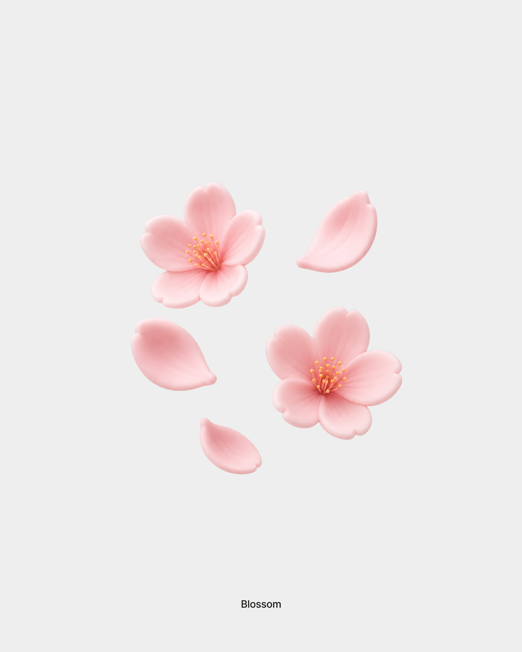
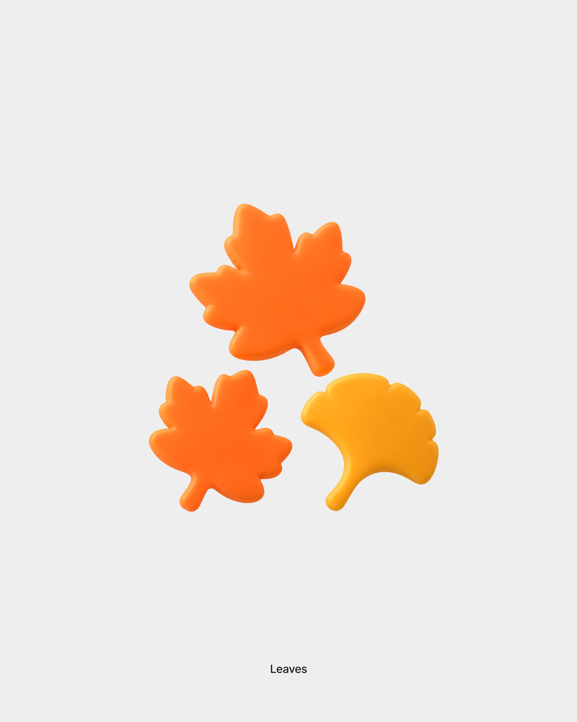
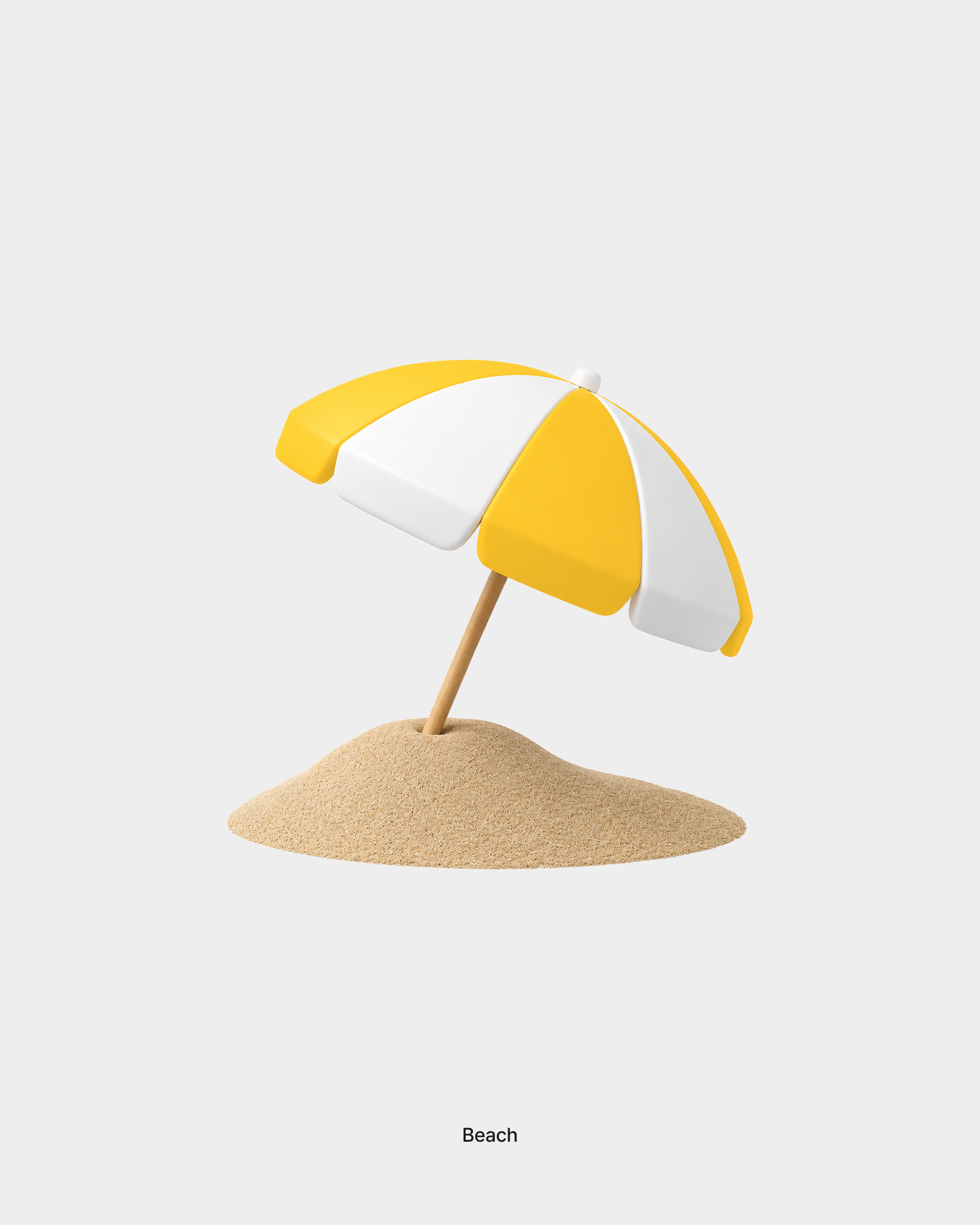
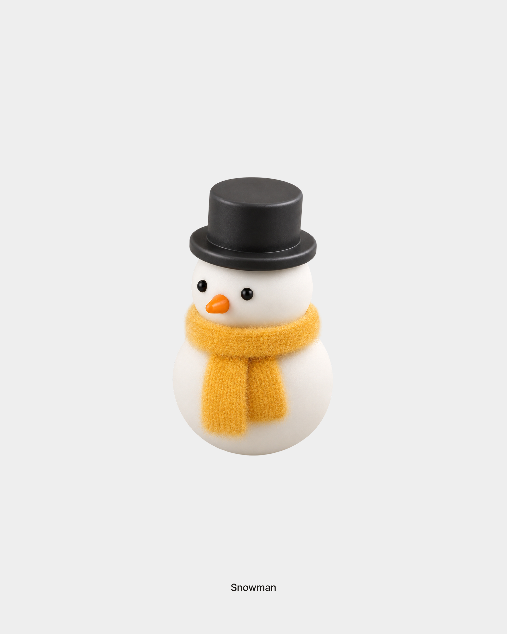
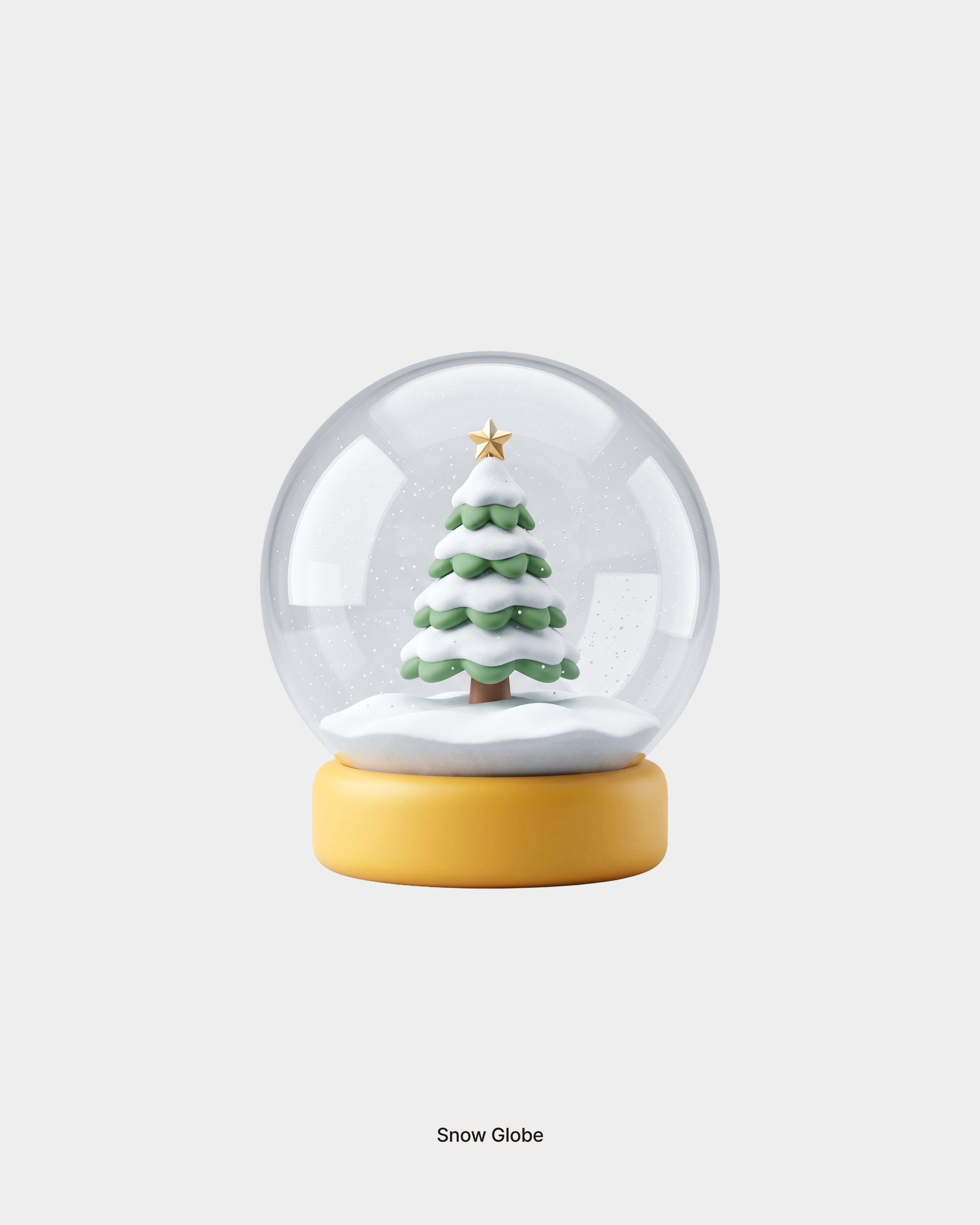
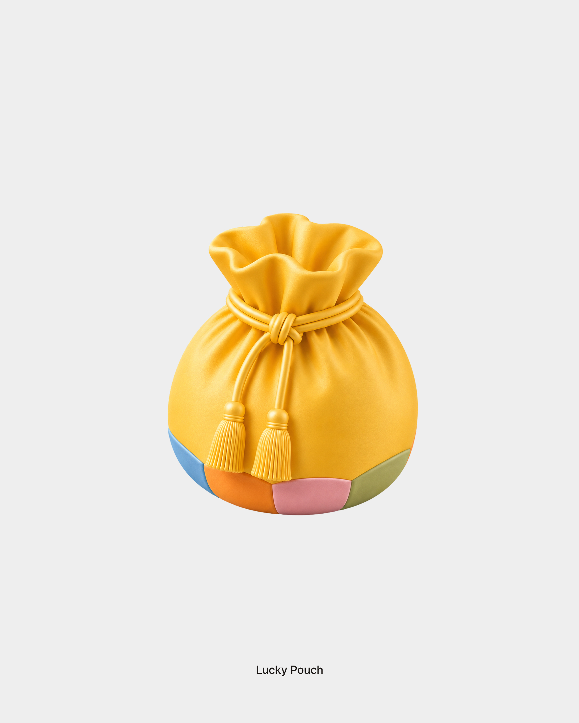
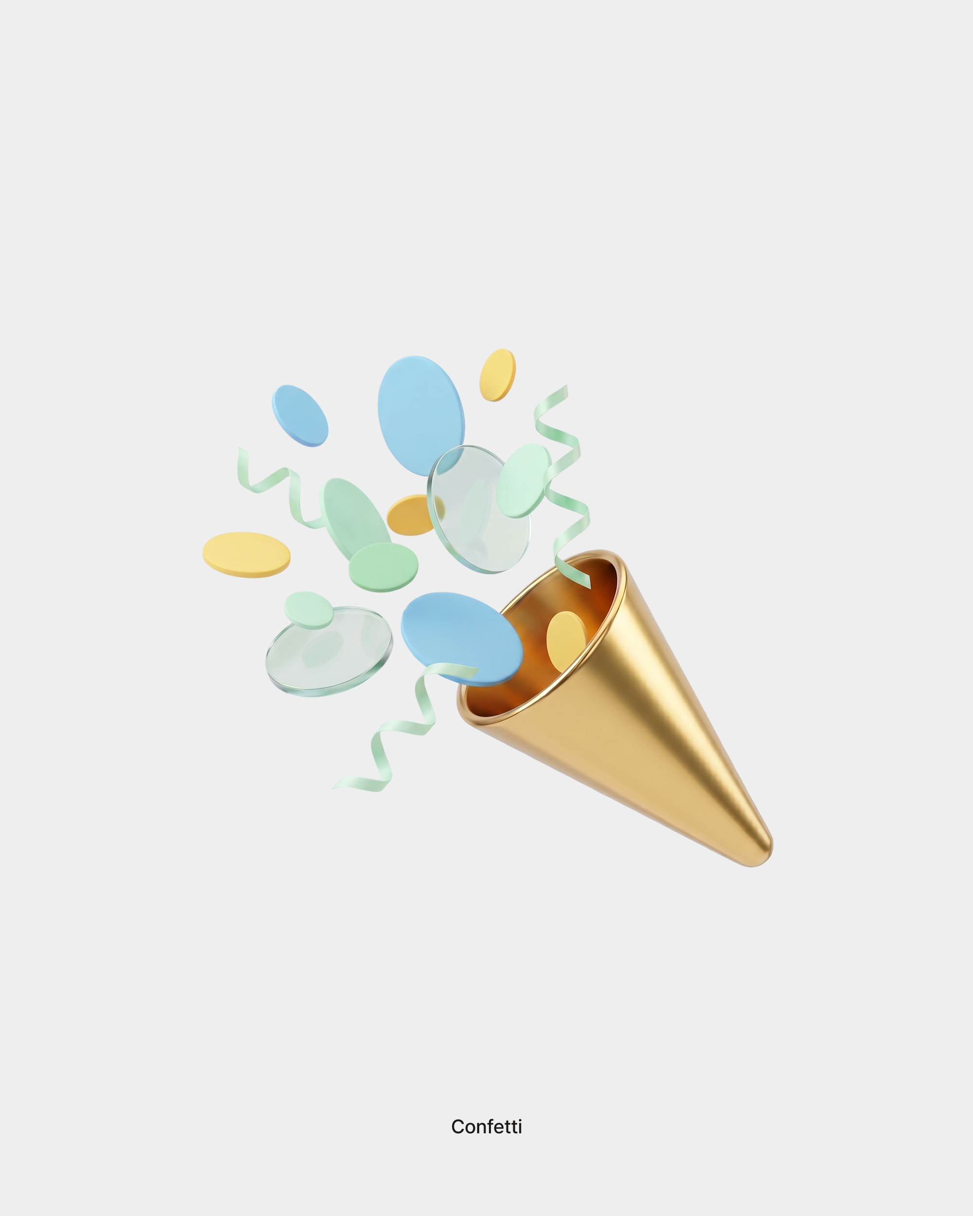
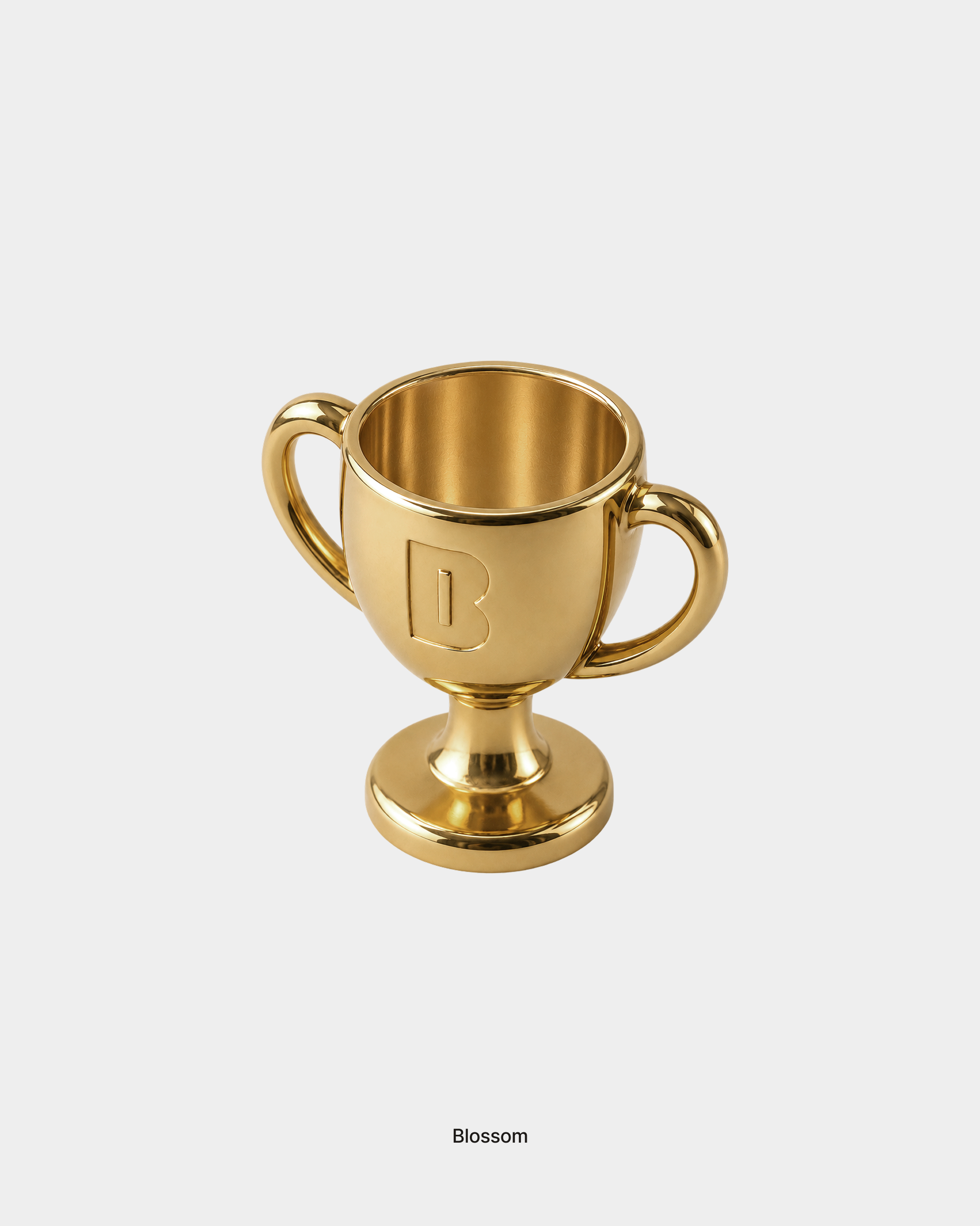
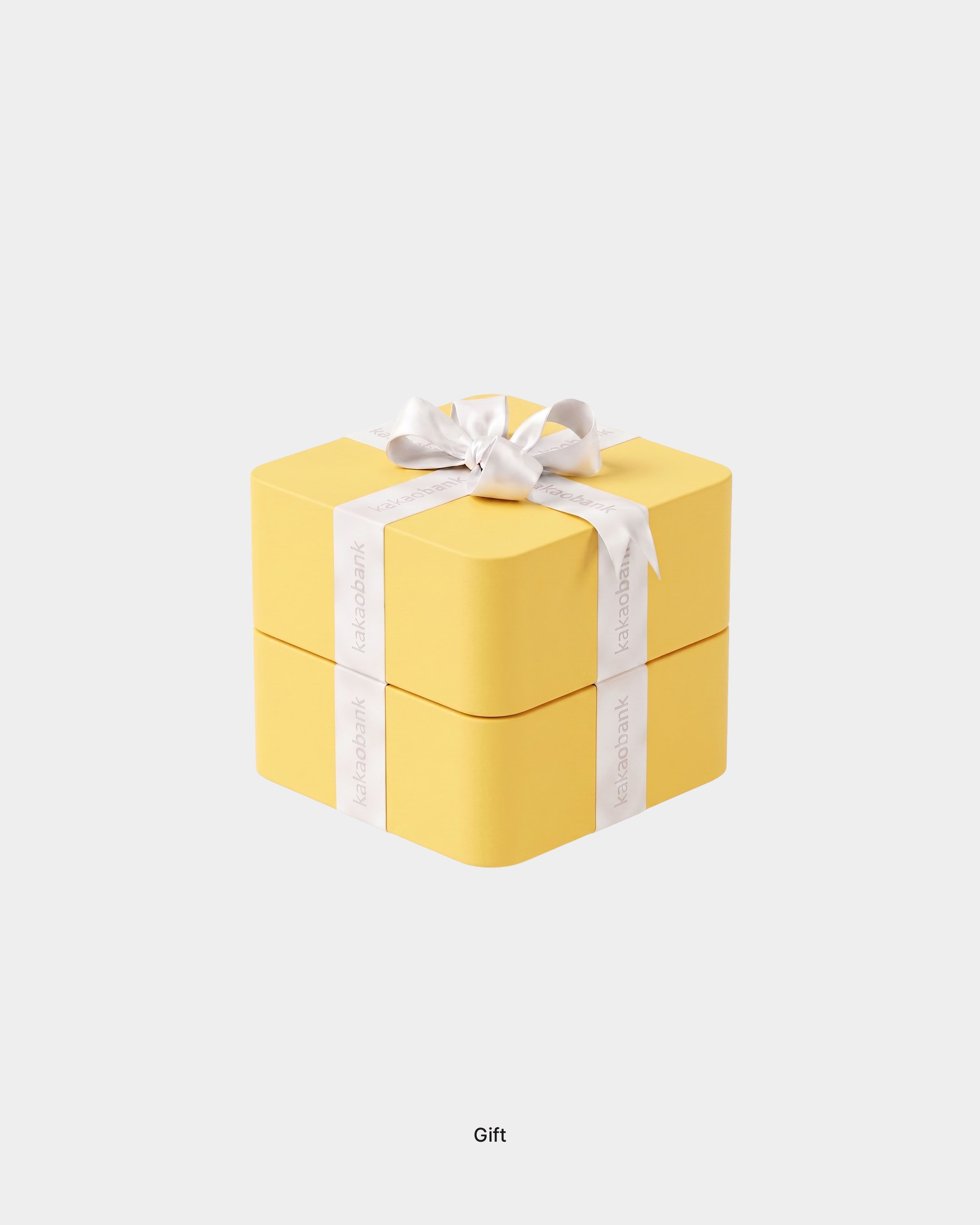
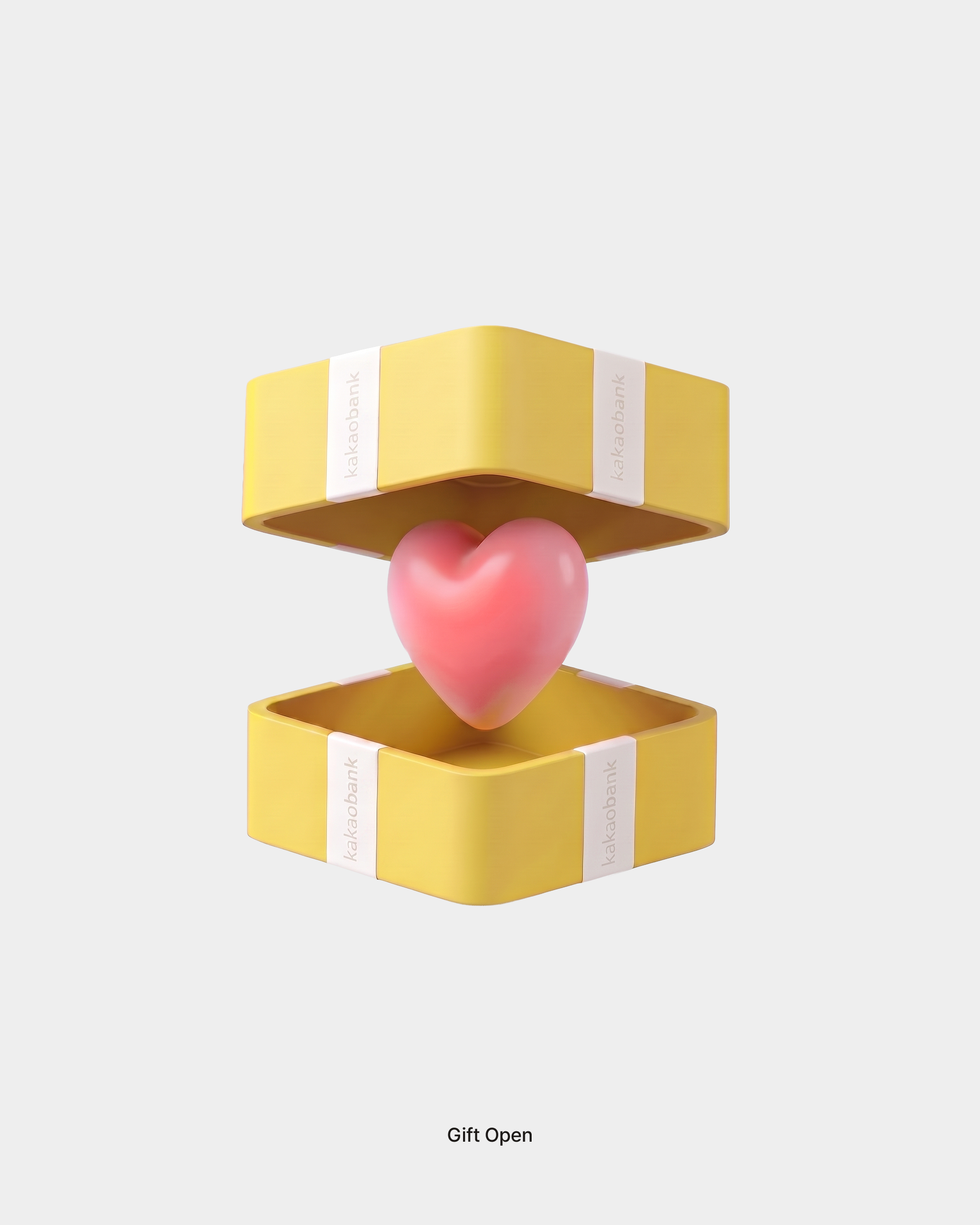
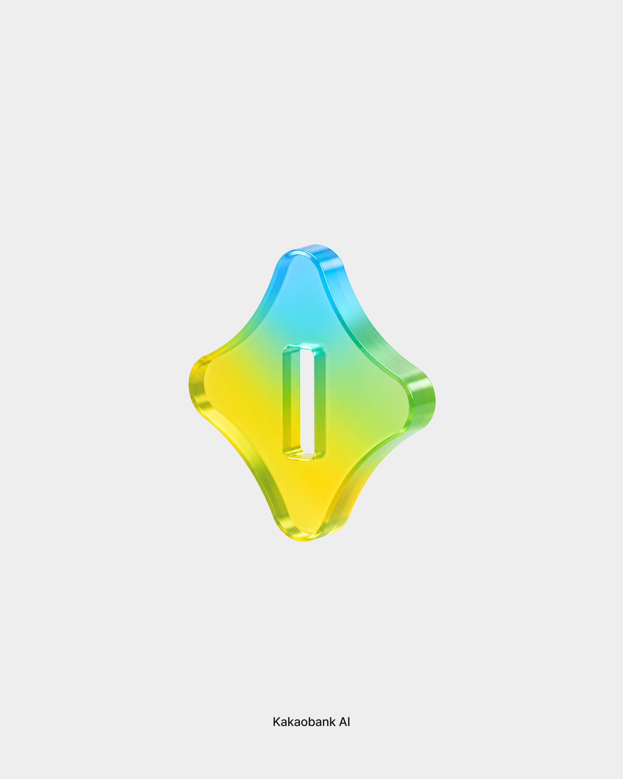
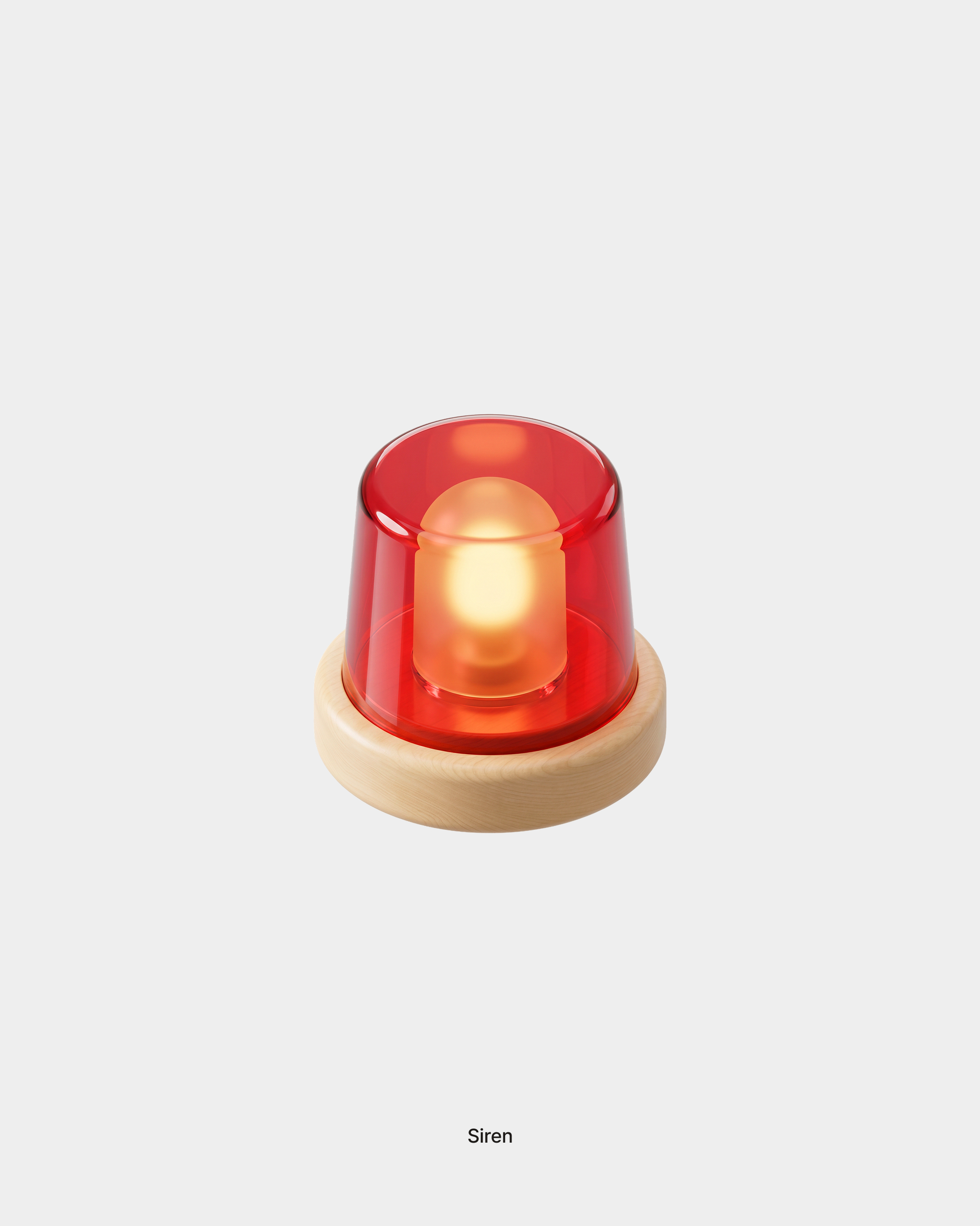
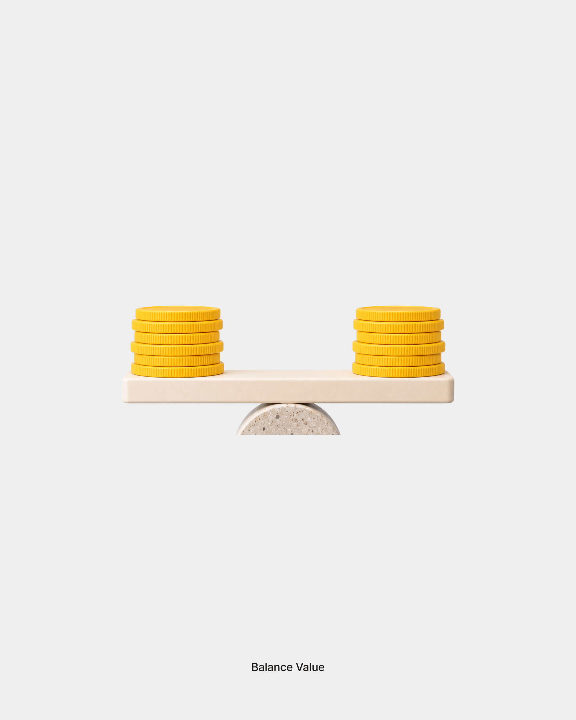
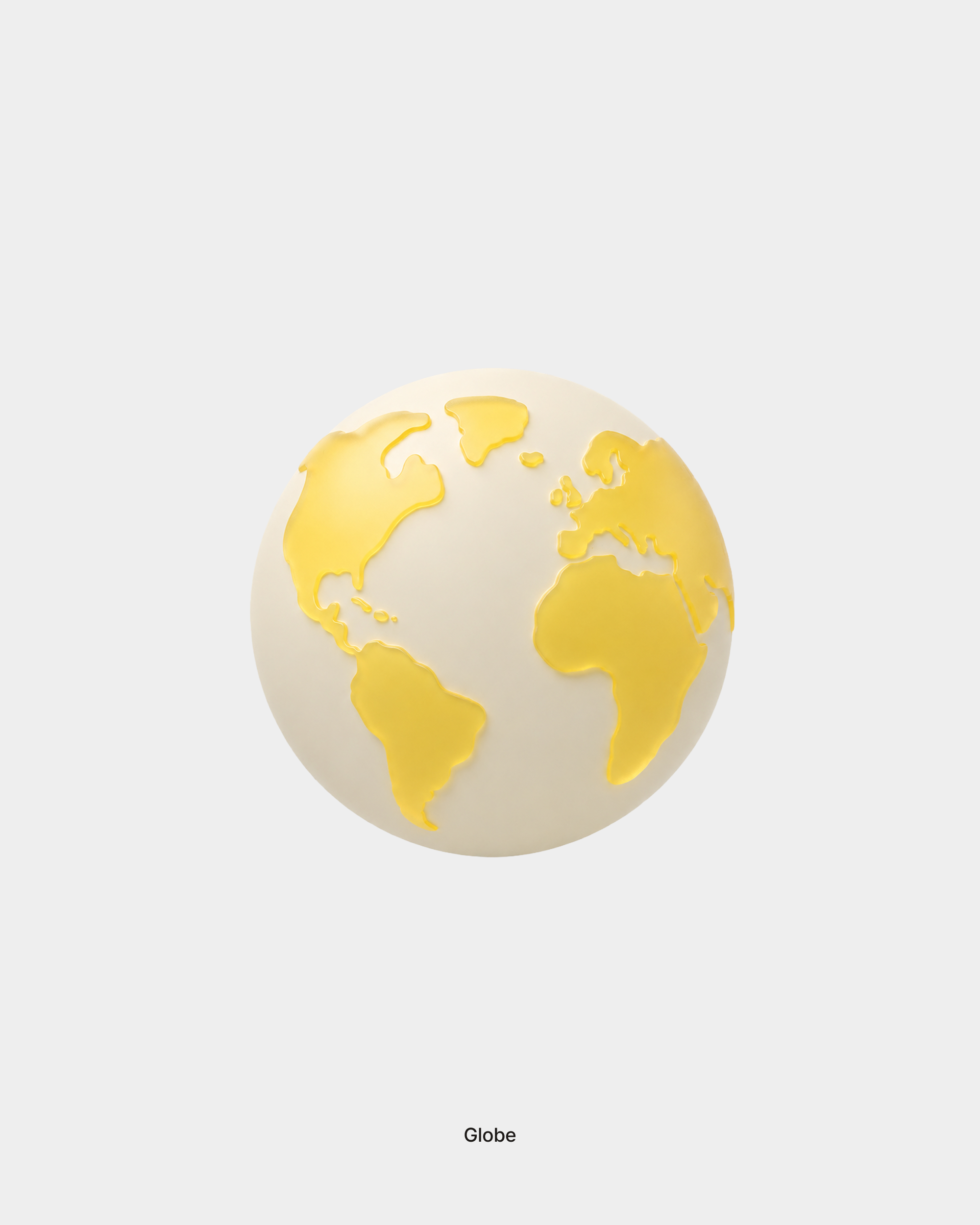
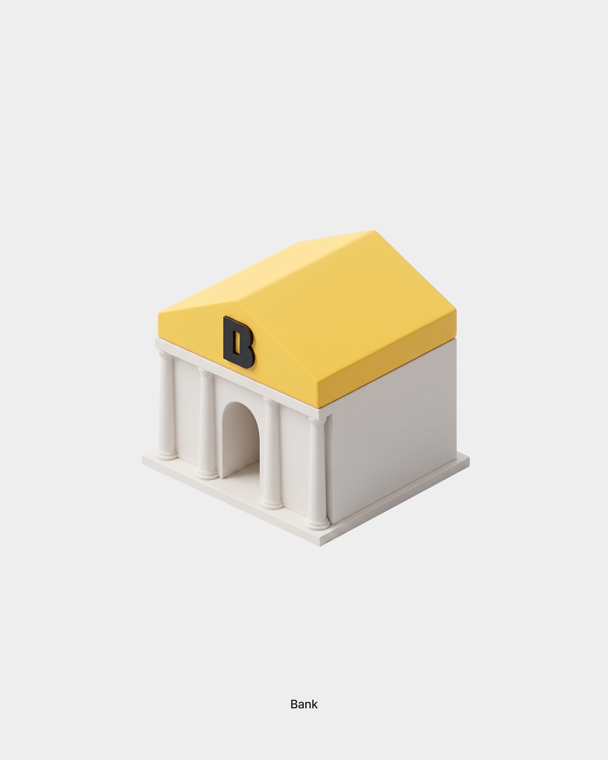
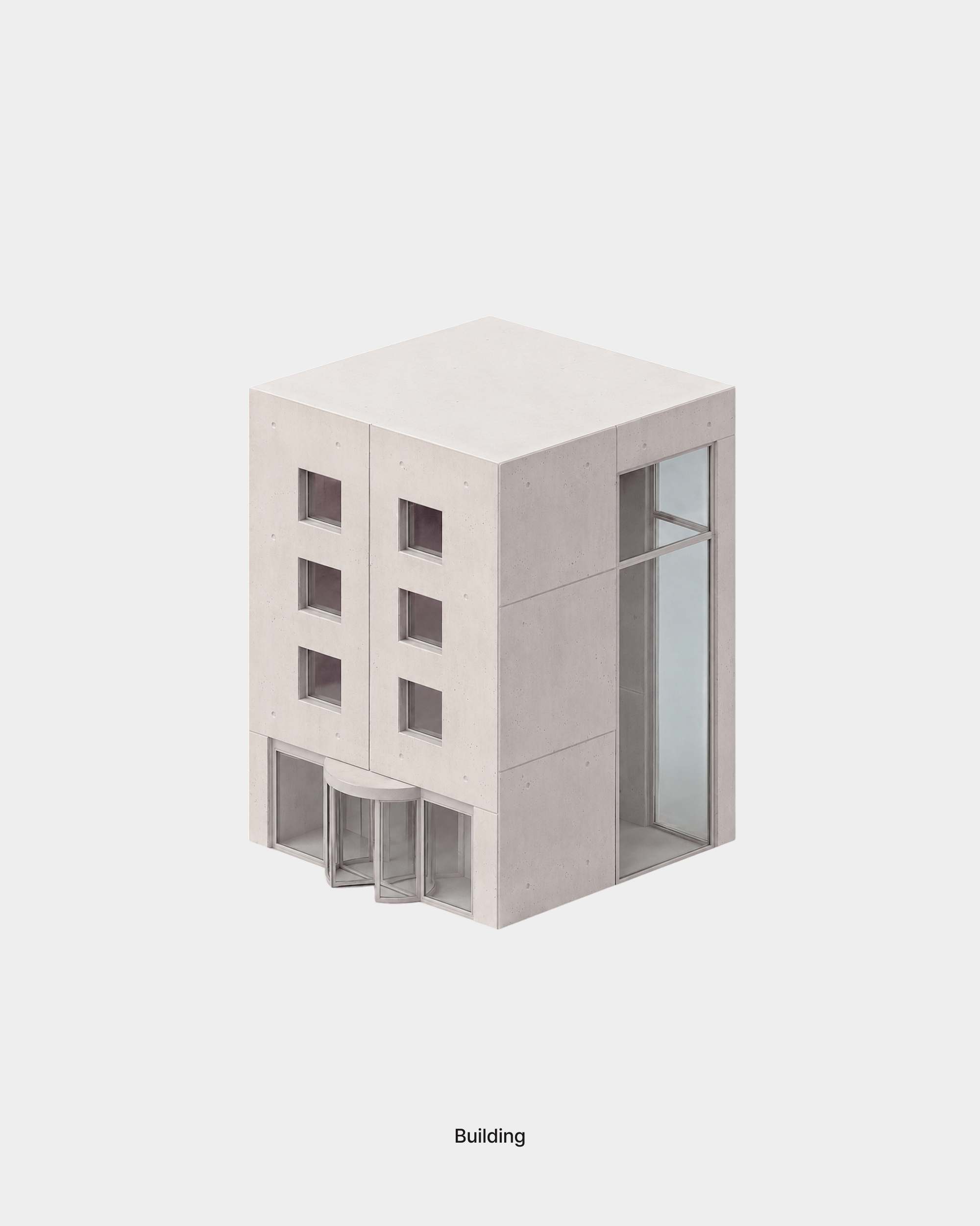
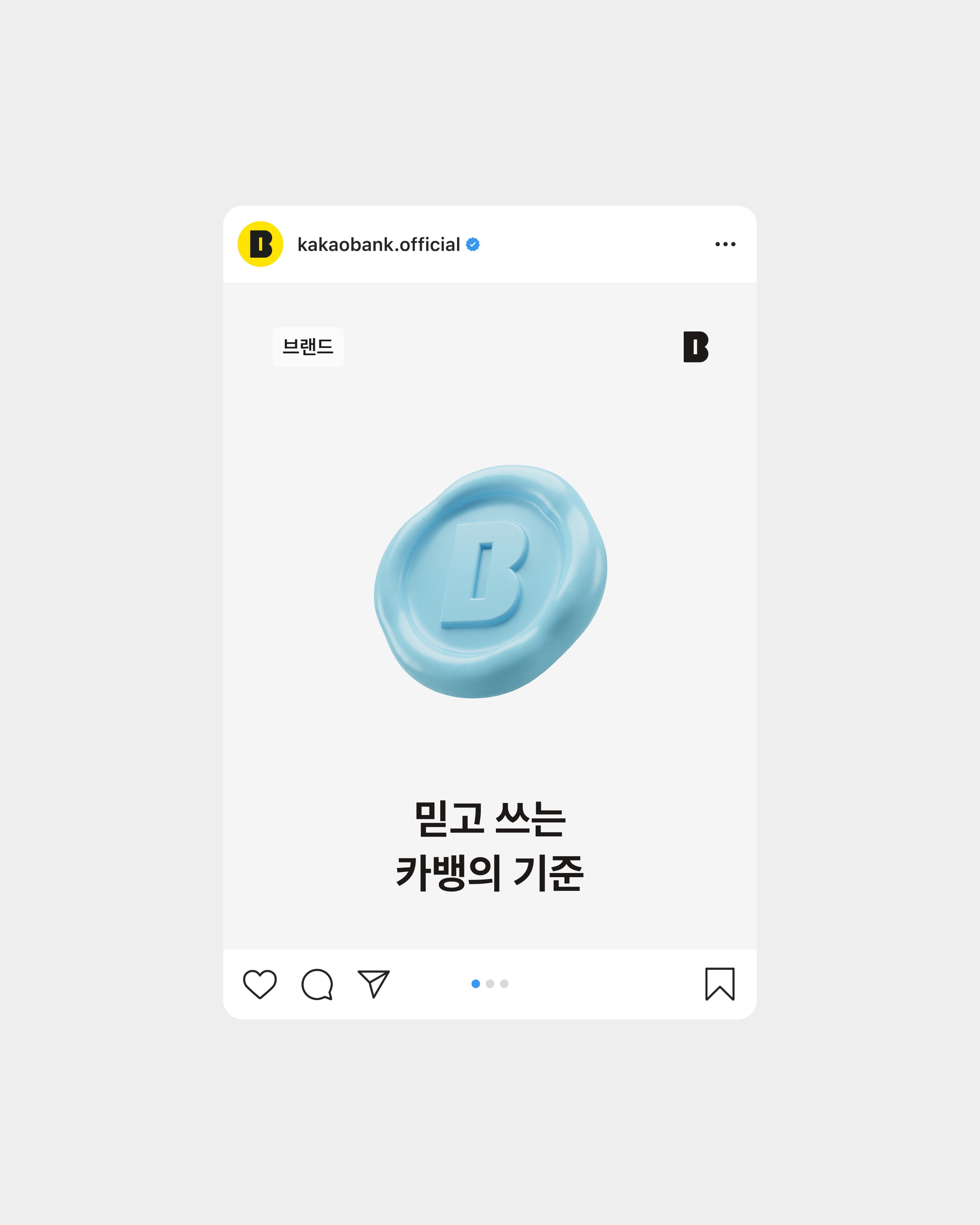
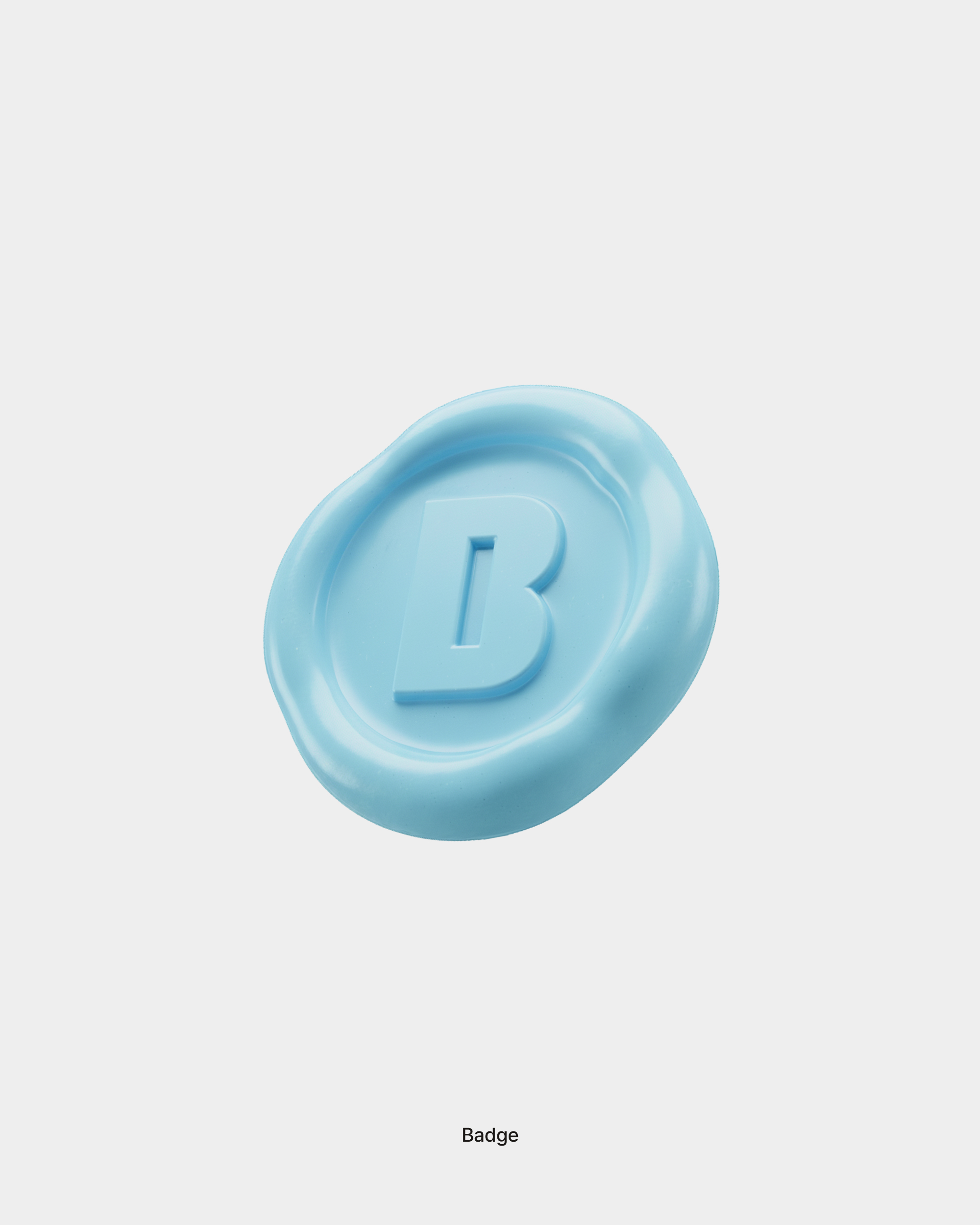
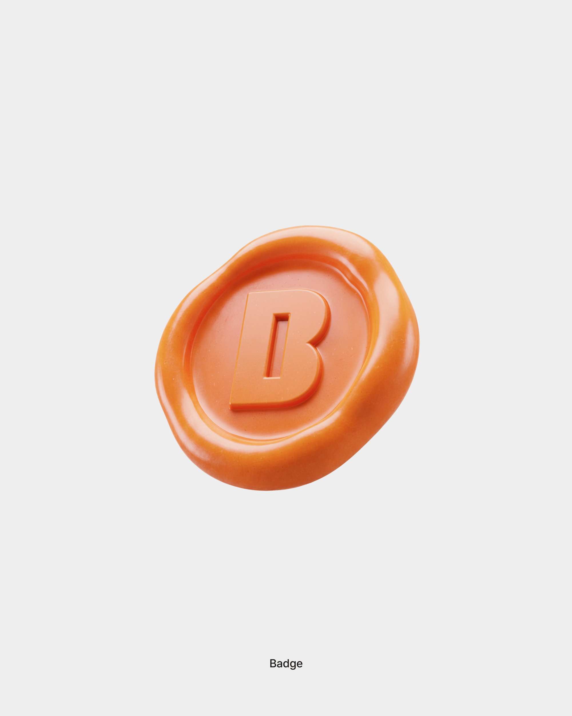
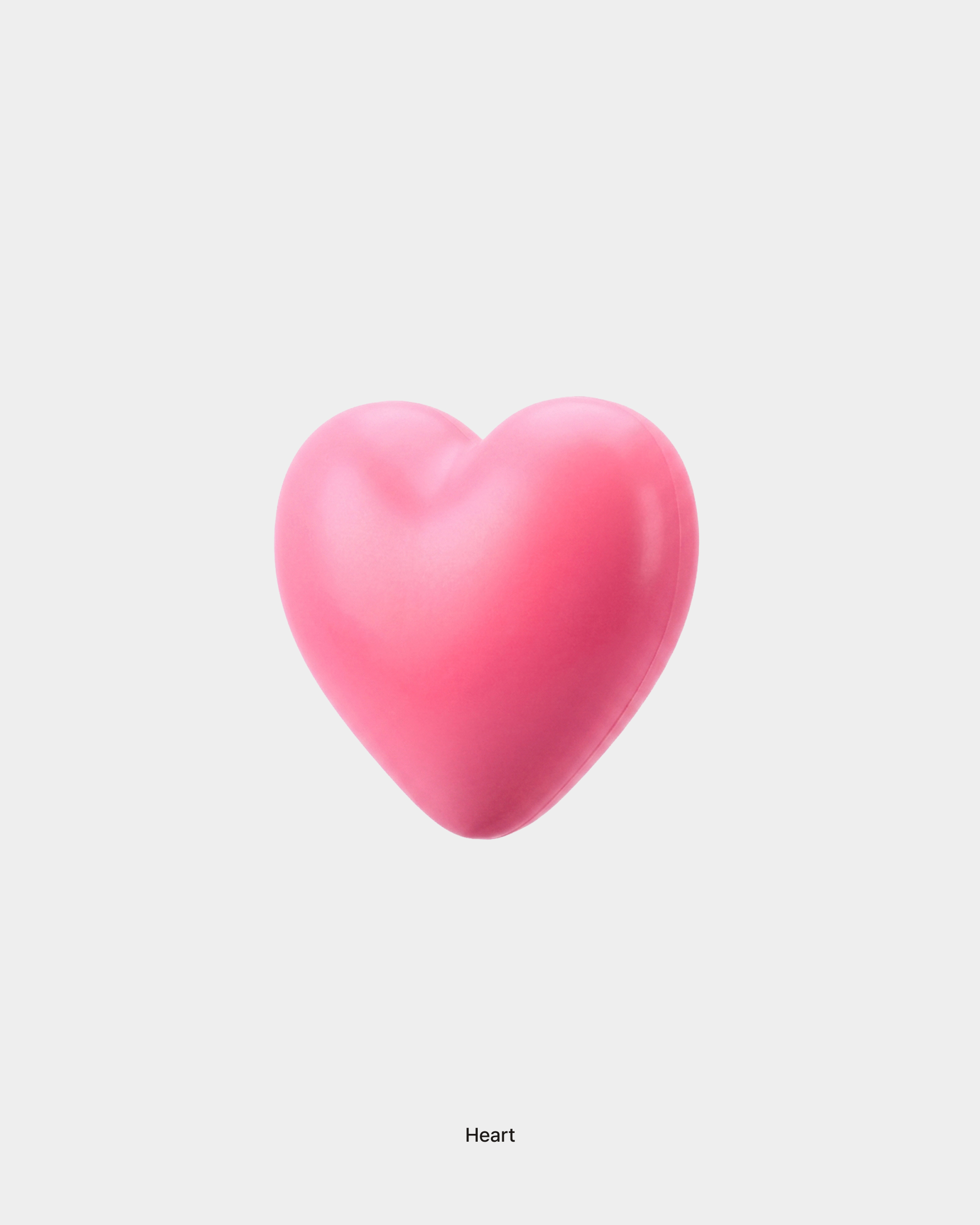
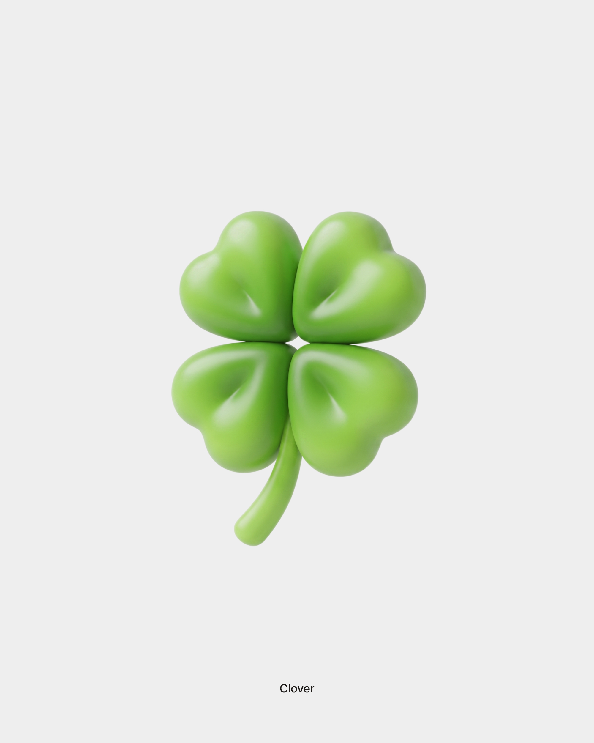
A total of 87 3D icons were created for KakaoBank’s content. To clearly express KakaoBank’s brand character, the icons primarily use the brand’s key colors, yellow and blue, while incorporating various color variations depending on the context. The forms were designed to be intuitive while maintaining KakaoBank’s friendly image. Each icon also uses materials suited to its shape and purpose, including plastic, metal, paper, and glass, to create a rich and distinctive visual expression. It is currently being actively used across KakaoBank’s Instagram and various content channels.
카카오뱅크 콘텐츠를 위해 총 87개의 3D 아이콘을 제작했습니다. 브랜드 특성을 명확하게 표현하기 위해 핵심 컬러인 옐로와 블루를 중심으로 사용하되, 콘텐츠의 맥락에 따라 다양한 색상 변주를 더했습니다. 친근한 이미지를 유지하면서 형태를 직관적으로 이해할 수 있도록 디자인했으며, 각 아이콘의 형태와 목적에 맞춰 플라스틱, 금속, 종이, 유리 등 다양한 재질을 적용해 풍부하고 차별화된 시각적 표현을 완성했습니다. 현재 카카오뱅크 인스타그램과 여러 콘텐츠 채널에서 활발하게 활용되고 있습니다. 아이콘 간의 비례와 조형 언어도 일관되게 설계해 콘텐츠가 달라져도 하나의 브랜드 경험으로 이어지도록 했습니다.