JIKJI Soft Landing Page Renewal
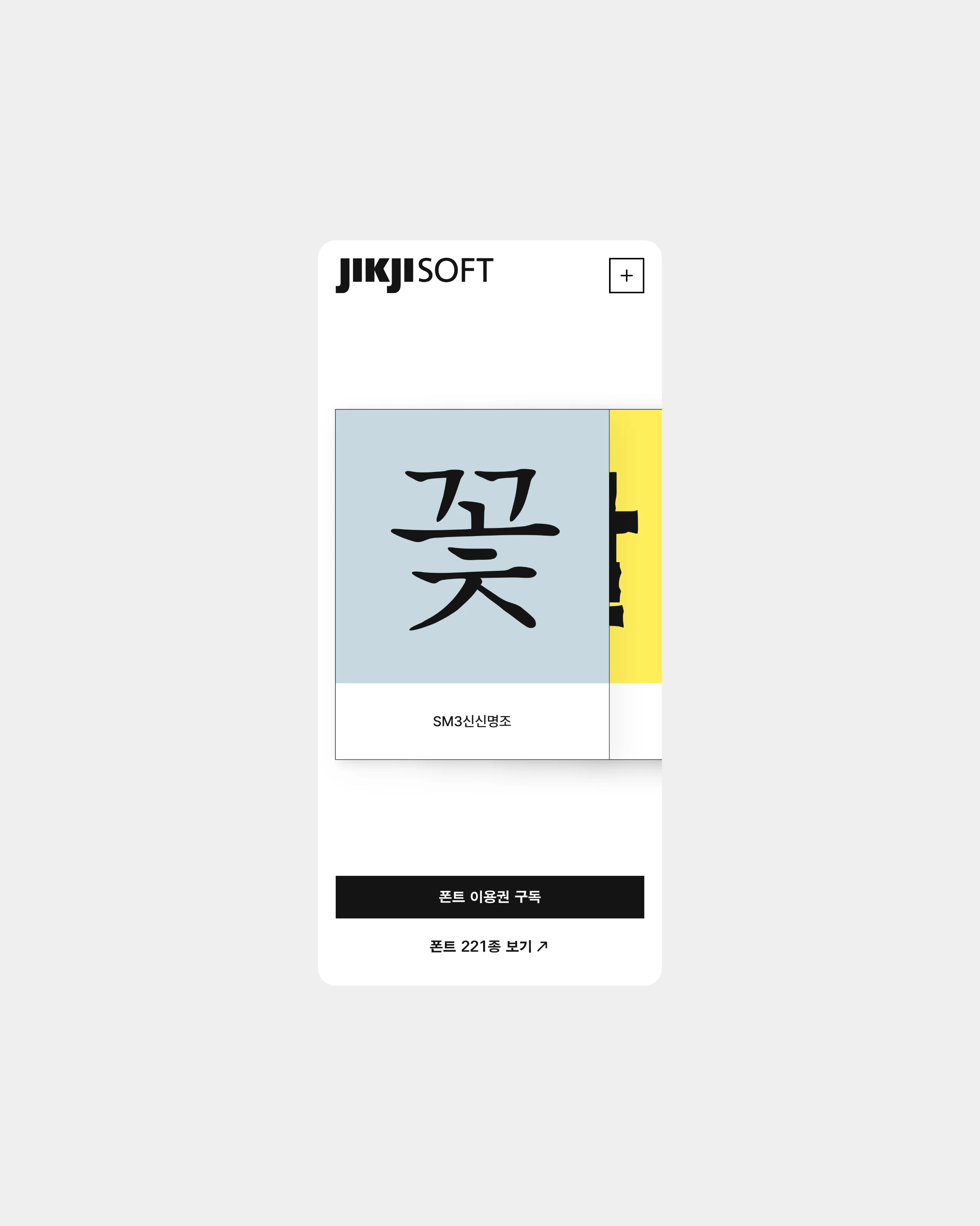
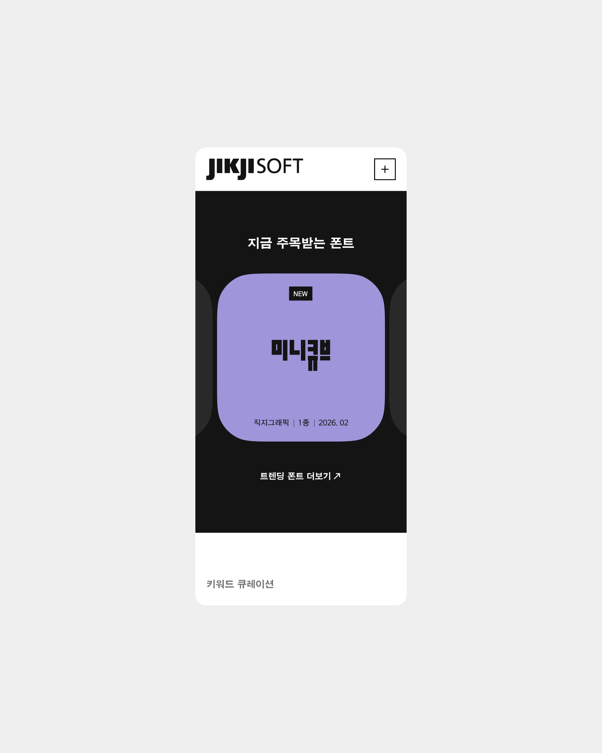
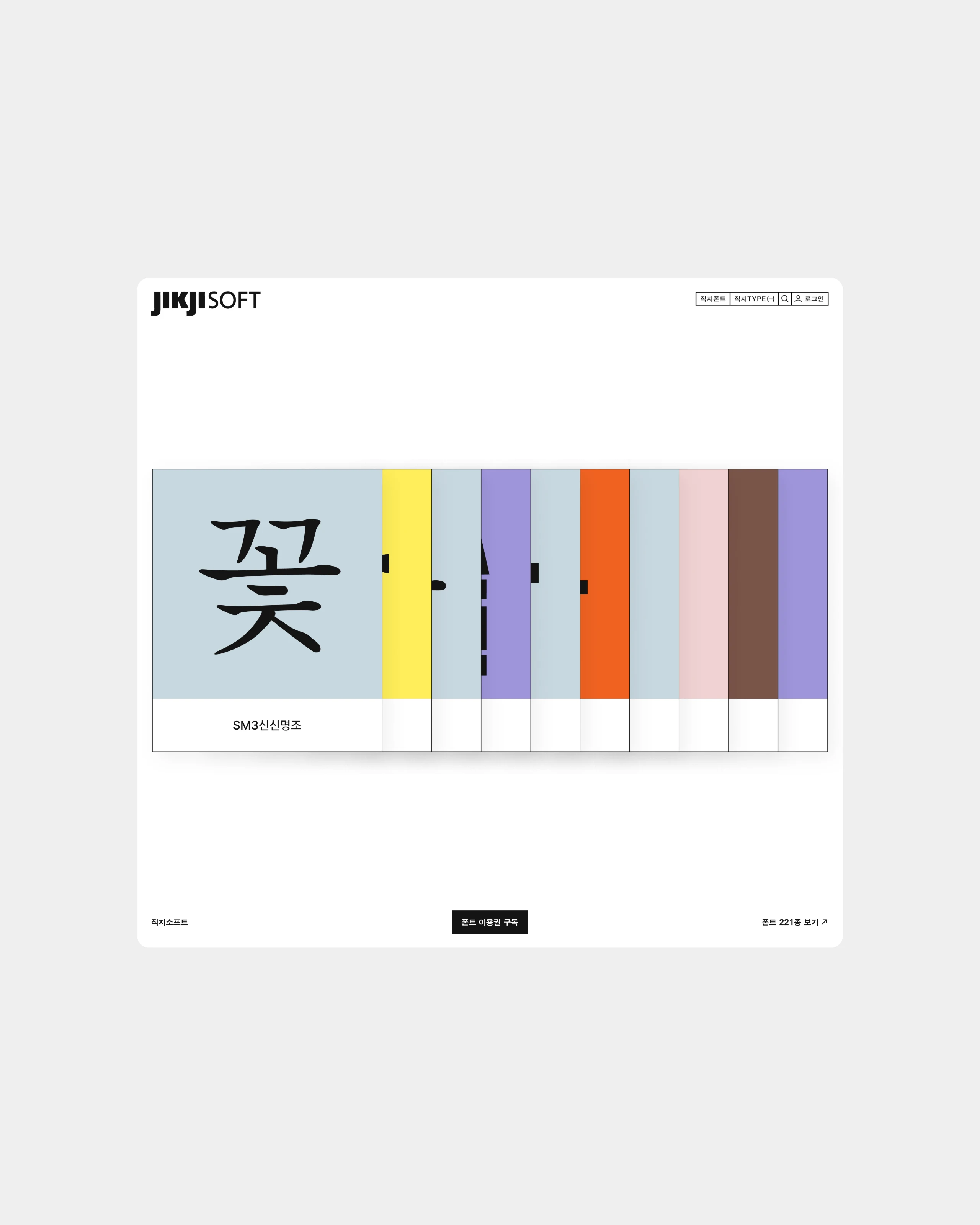
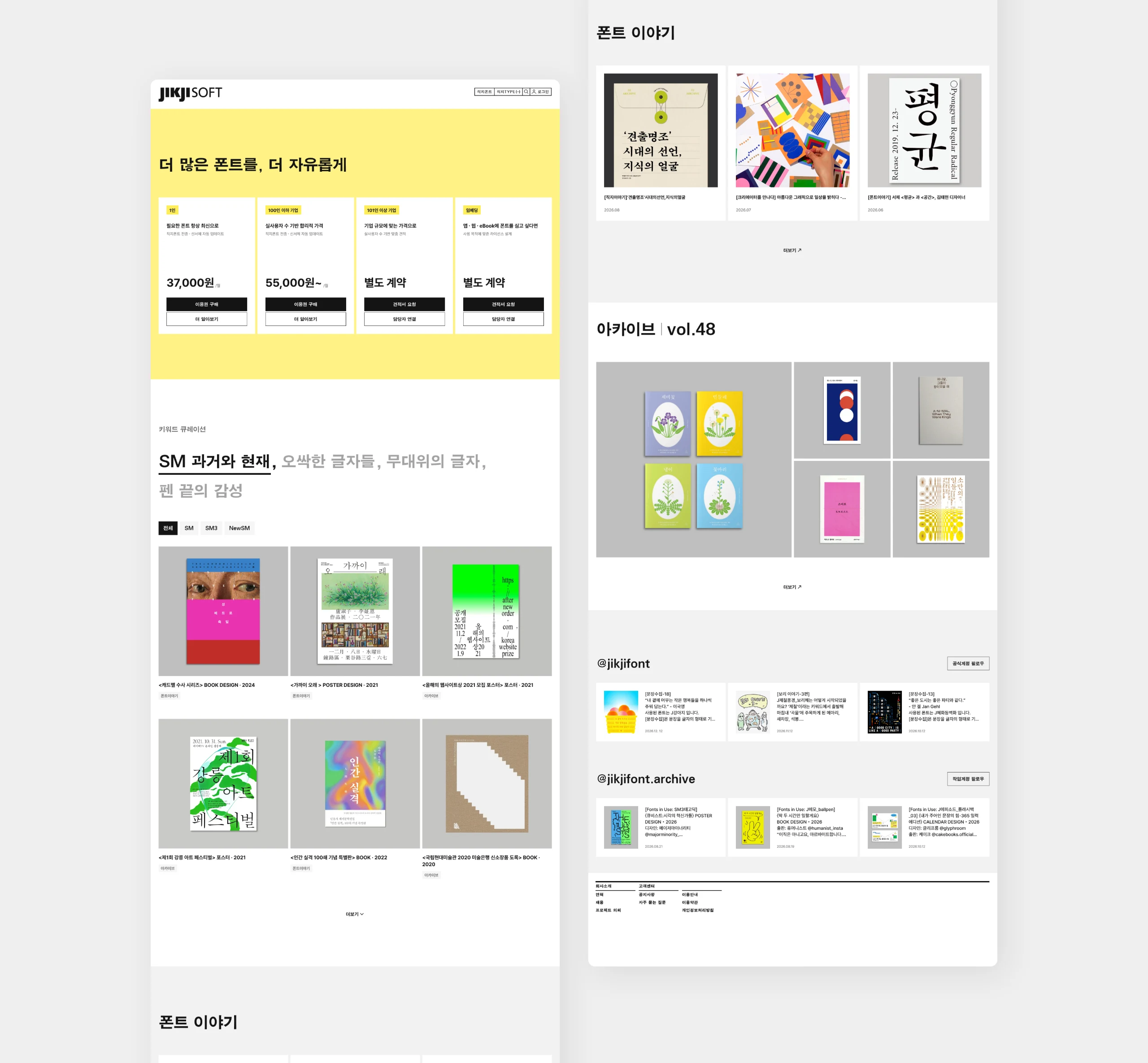
Letters have evolved alongside the technologies and media of their time. Through the transformation of a Korean character, “한,” from stone carvings and movable type to pixels and vector fonts, we visualized the evolution of typography and technology. Its changing forms highlight the flexibility and possibilities of letterforms, reflecting JikjiSoft’s vision of carrying forward Jikji’s spirit and technological legacy while adapting to a changing environment. We also organized its diverse fonts and content into an intuitive card-based system, helping users explore each offering at a glance. The experience encourages users to look beyond their font search and discover more of JikjiSoft’s rich collection.
글자는 시대의 기술과 매체에 따라 새로운 모습으로 변화해 왔습니다. 돌에 새긴 문자에서 활자를 배열하는 조판 기술로, 픽셀로 표현되는 디지털 문자를 거쳐 자유롭게 확장되는 벡터 폰트까지. 하나의 ‘한’이 서로 다른 방식으로 구현되는 모습을 통해 글자와 기술이 함께 진화해 온 과정과 타이포그래피의 확장성을 표현했습니다. 이는 직지의 정신과 기술적 유산을 계승하며, 빠르게 변화하는 환경에 유연하게 대응하고 발전하는 직지소프트의 방향성을 담고 있습니다. 또한 다양한 폰트와 콘텐츠 자산을 직관적인 카드 형태로 구조화해 각 콘텐츠의 특징을 한눈에 살펴보고 쉽게 탐색할 수 있도록 구성했습니다. 필요한 폰트를 찾는 과정에서 다른 콘텐츠로도 자연스럽게 관심을 넓히고, 직지소프트의 풍부한 자산을 발견할 수 있도록 탐색 경험을 확장했습니다.